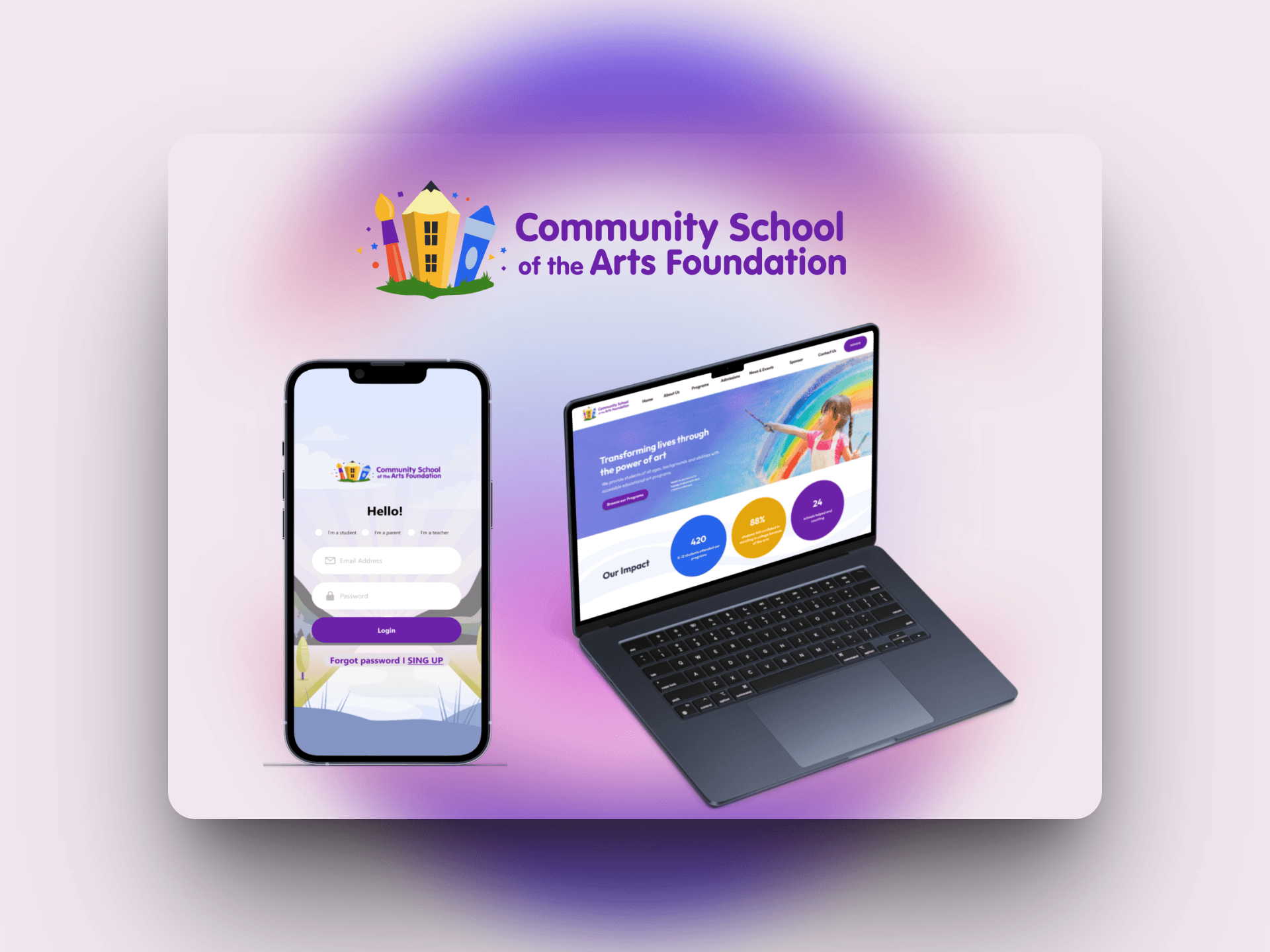
CSOAF: Driving Engagement via Gamification & Personalization
Client
CSOAF
Team
Skills
End-to-End Product Design, Strategic UX Research, Design Systems & Cross-Functional Collaboration
Duration
5 Months
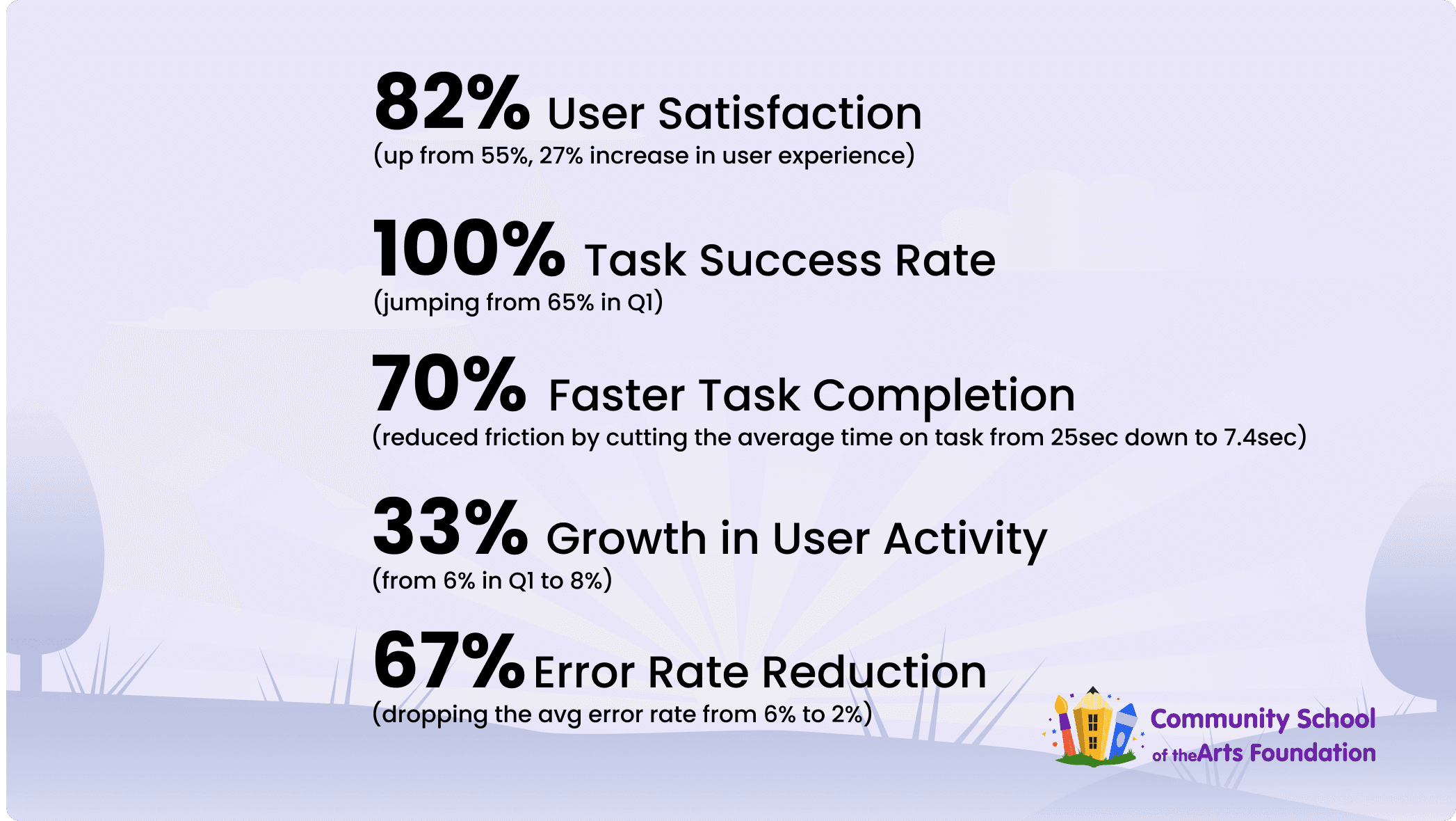
The Impact: A Transformed Experience
Our new design was a huge success. We measured the results to prove it:
My Role
As a core designer on the team, my work focused on foundational analysis and core feature design. I led the comparative analysis that helped shape our product strategy. From there, I owned the end-to-end design for the app's key user experience, including the student profile, teacher profile, and the complete course sign-up flow. I also co-developed our design system, a contribution that accelerated our team's workflow by an estimated 20%, and assisted with creating marketing assets for the app's launch.
(one of the promo videos I made)
The Challenge: A System-Wide Failure
Community School of the Arts Foundation (CSOAF) is a non-profit with a vital mission: providing arts education to K-12 students, including participants with moderate to severe disabilities. While supported by a global community of 5 million, their internal operations were holding them back.
The school was struggling with a system-wide failure that affected everyone:
Staff were buried in paperwork, relying on inefficient, manual registration.
Students were disconnected and unmotivated, with no modern way to track progress, engage with courses, or connect with teachers.
Our strategy was to design two platforms at once to solve both problems.
Part 1: The Website & Dashboards (Solving for Staff) To fix the admin burden, we designed a new digital enrollment system. I contributed the optimized enrollment forms for students, teachers, and parents, which were designed to simplify registration and reduce data errors.
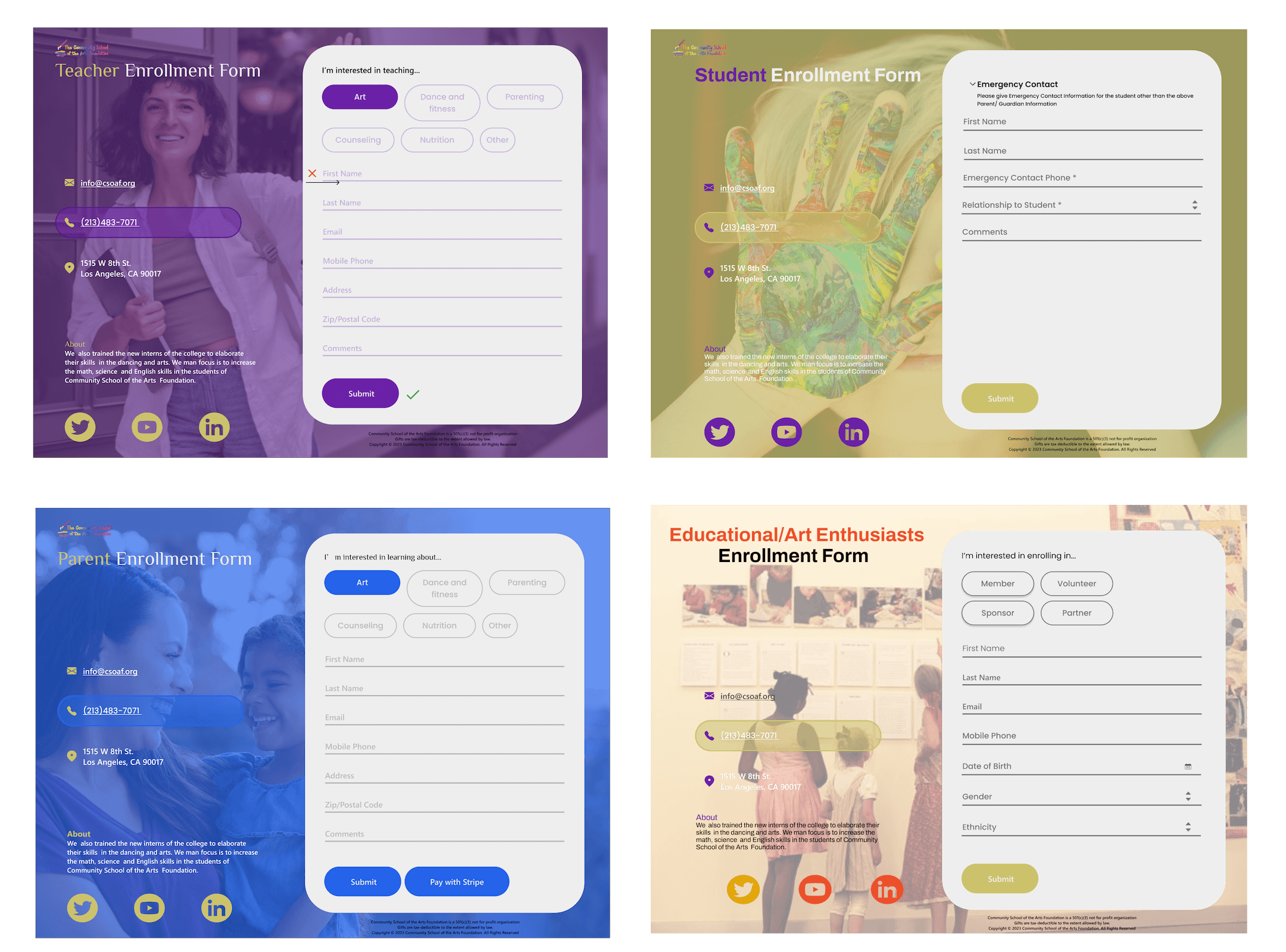
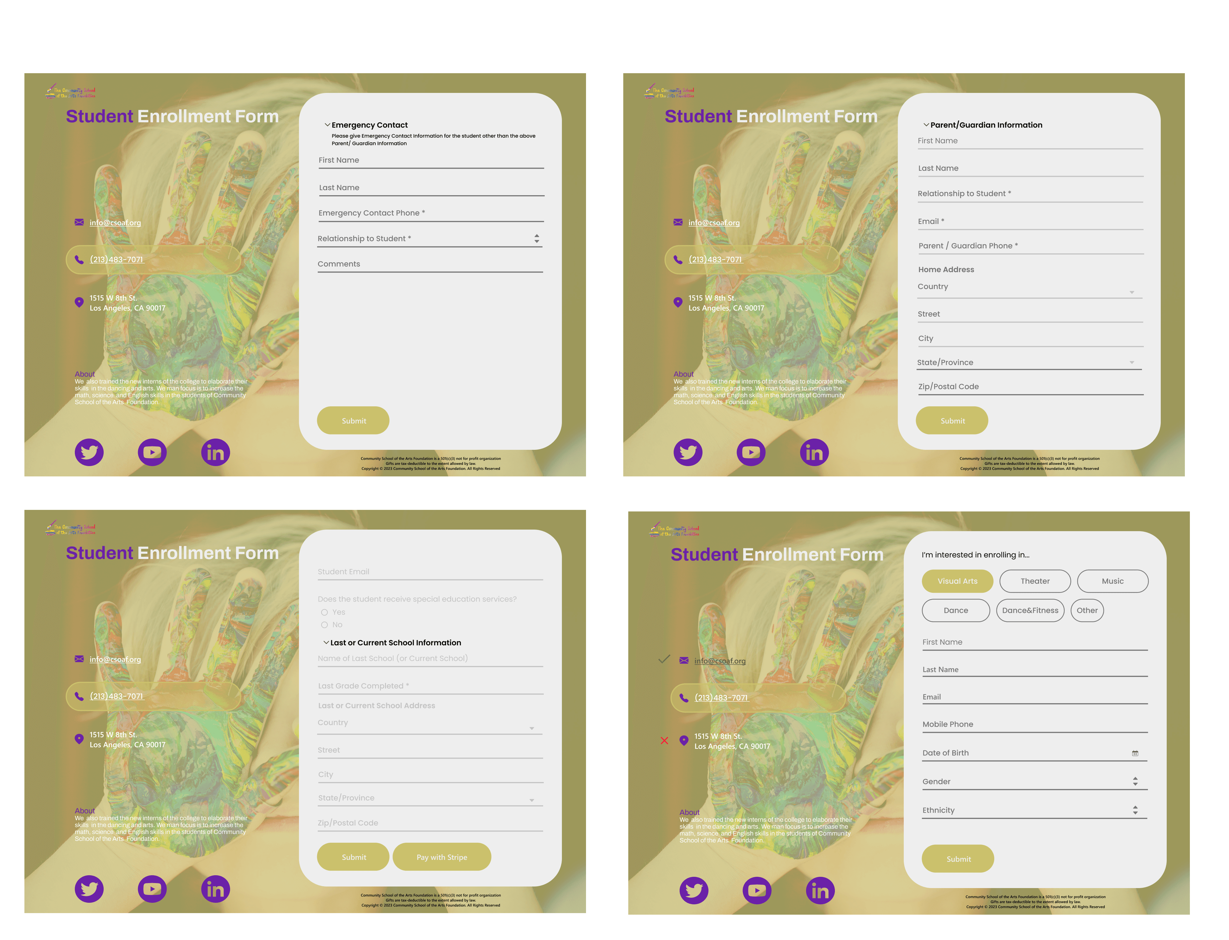
(ex: steps for student enrollment forms)
Part 2: The Mobile App To solve the student engagement problem, we designed a new mobile app to complement the website. This app would focus on creating a motivating, accessible, and interactive experience for students on the go.
This case study will now focus on my work designing the core experience of the mobile app.
Our main goal was to create a seamless user experience by carefully balancing the learning curve and cognitive load. To achieve this, our agile roadmap broke down the development process into manageable, incremental phases, a strategy we employed to minimize complexity and risk as we designed and developed the product.
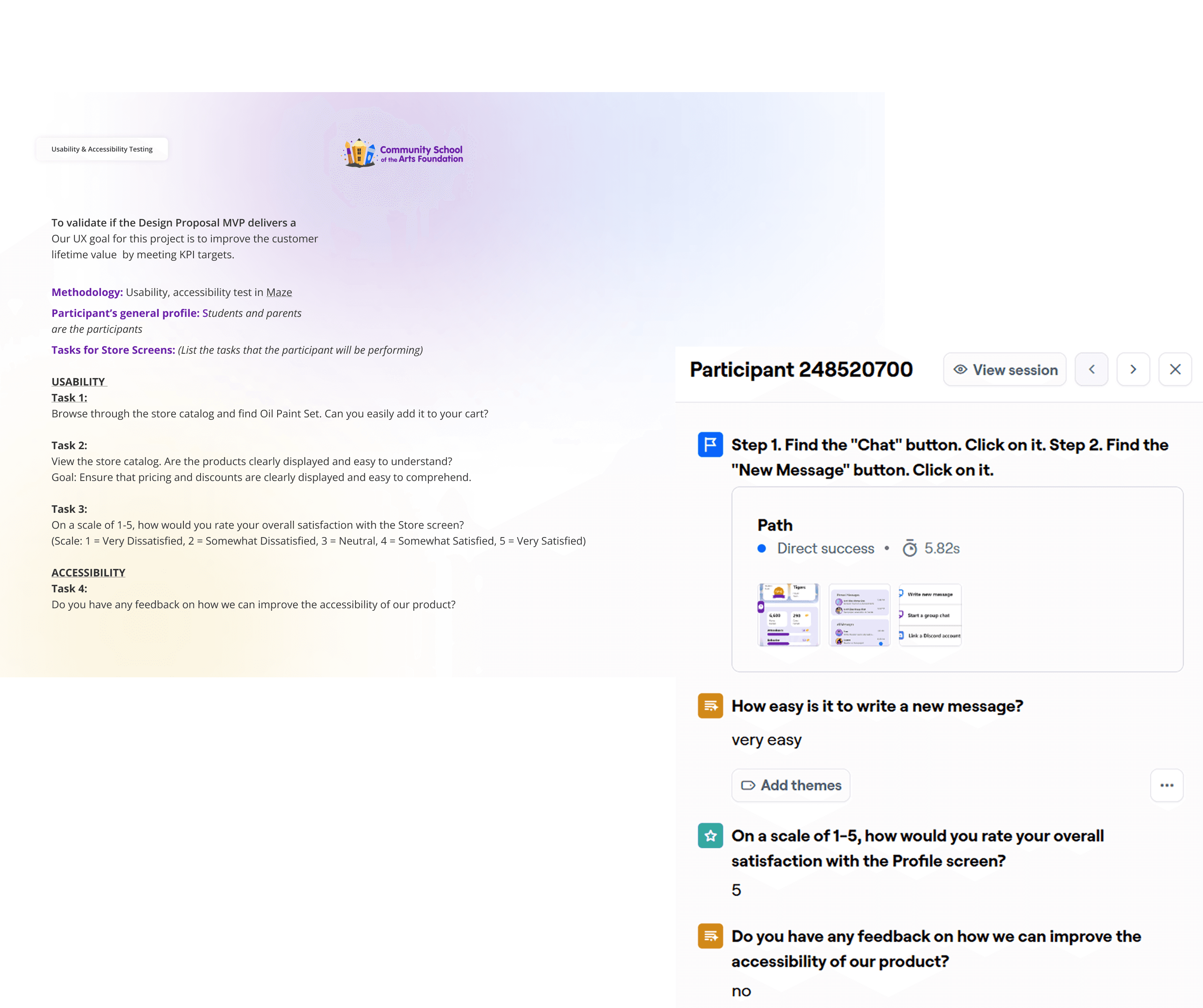
To kick off our research, we conducted stakeholder interviews to identify the core pain points, goals, and needs of our users. This foundational feedback was essential for shaping our design strategy.
Our Plan: Finding the "Aha!" Moment
To find a solution, we started with a simple plan.
1. Talk to Stakeholders
We started by interviewing school leaders to understand their core goals and biggest pain points.
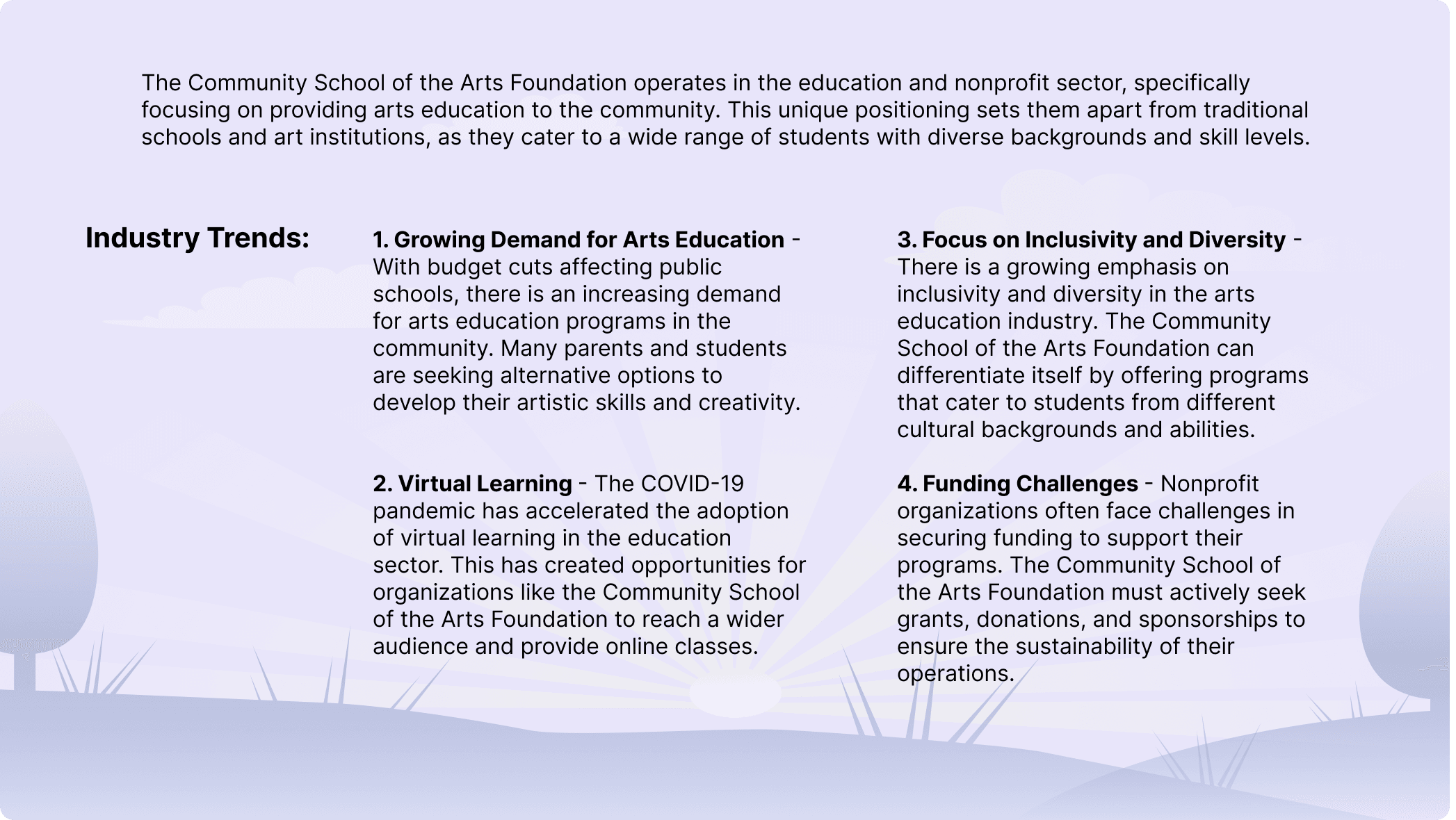
2. Study the Market
Next, we studied the entire educational landscape. This included:
Industry Trends: Identifying what's new and working in EdTech.
Competitor Analysis: Looking at other arts foundations to see what they were doing.
Comparator Analysis: Studying successful apps like Khan Academy and LiveSchool to learn from the best.
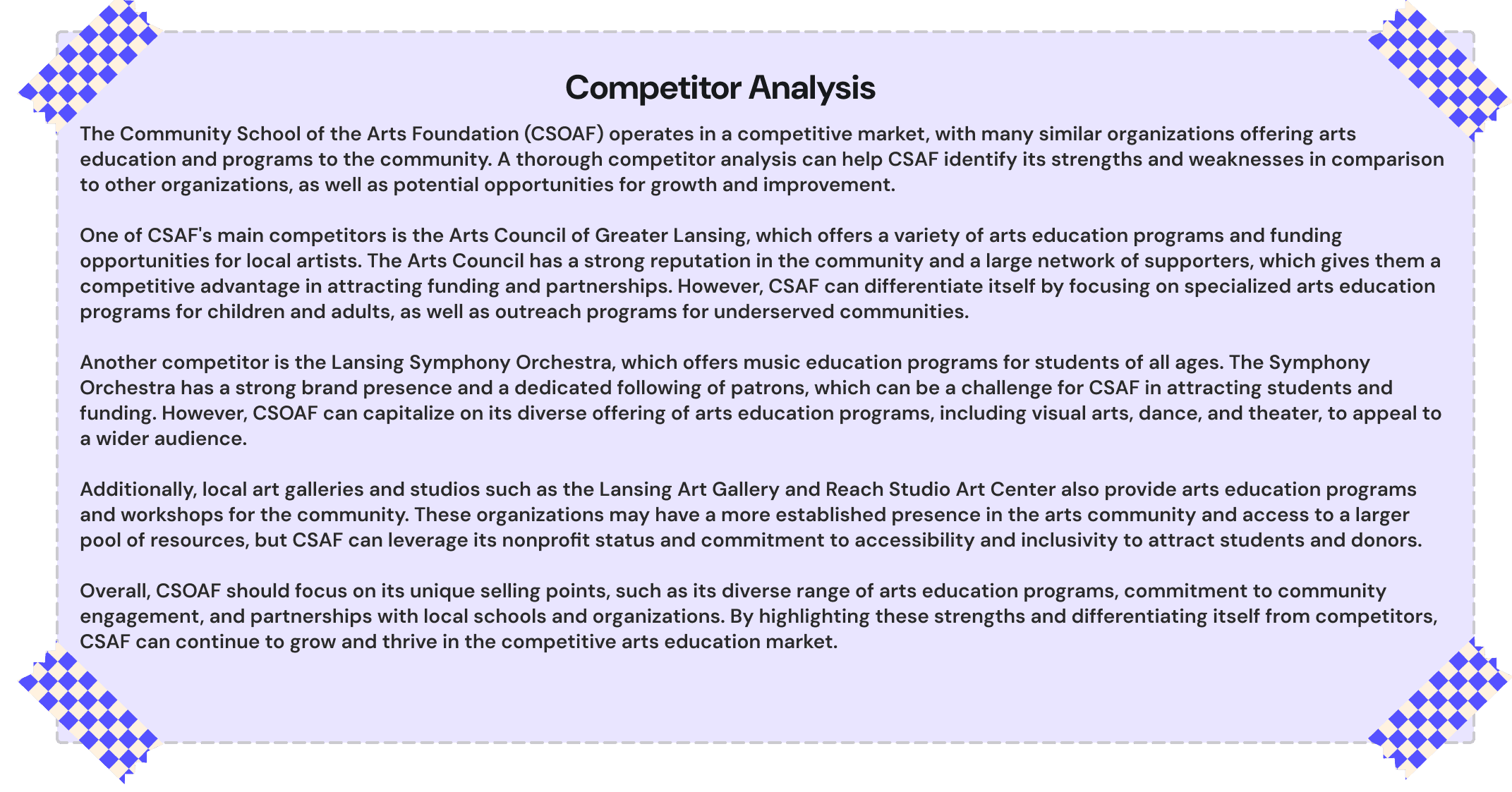
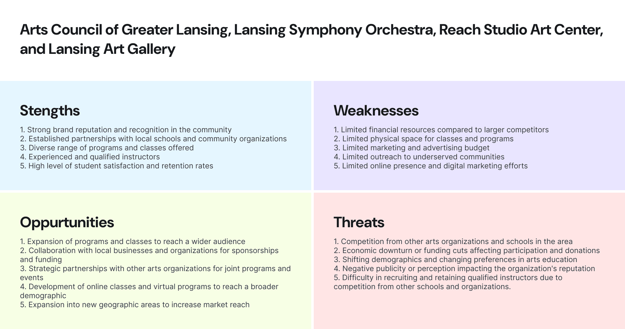
(Competitor Analysis and its SWOT Analysis)
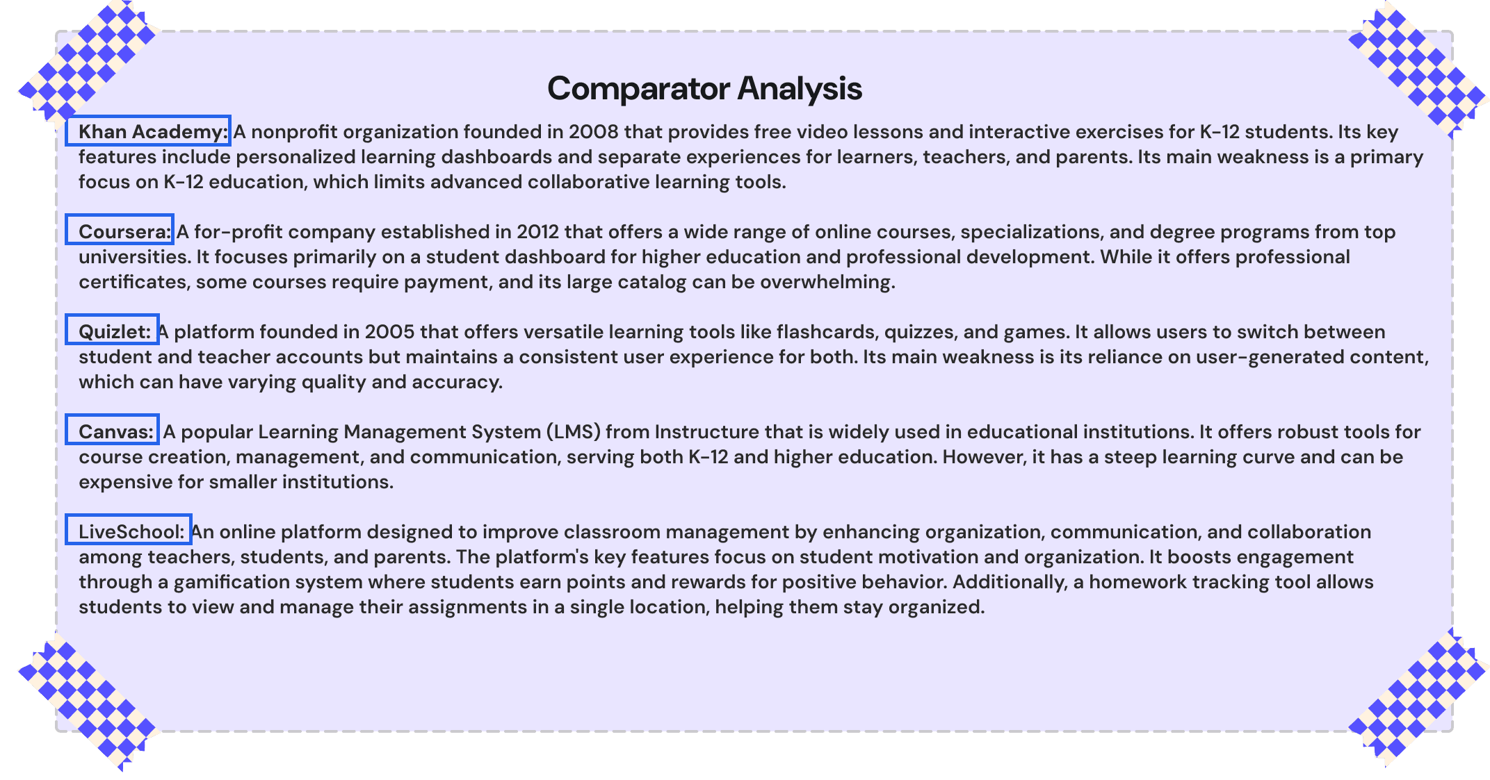
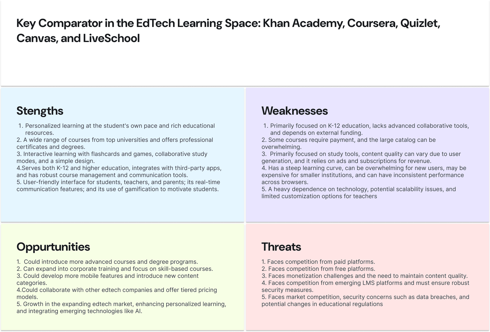
(Comparator Analysis and its SWOT Analysis)
3.The "Aha!" Moment & Our MVP Strategy
Our research—spanning stakeholder interviews, user surveys, and competitive analysis—pointed to one clear "Aha!" moment. The most effective platforms all centered on three key principles: Personalization, Gamification, and Real-Time Feedback.
This insight became our core strategy. We designed a focused MVP to deliver immediate value through three core features:
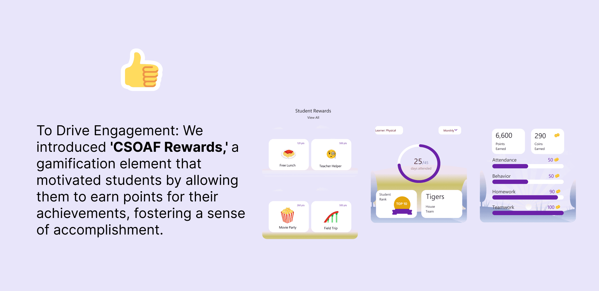
Gamified Rewards: To drive engagement by rewarding achievement.
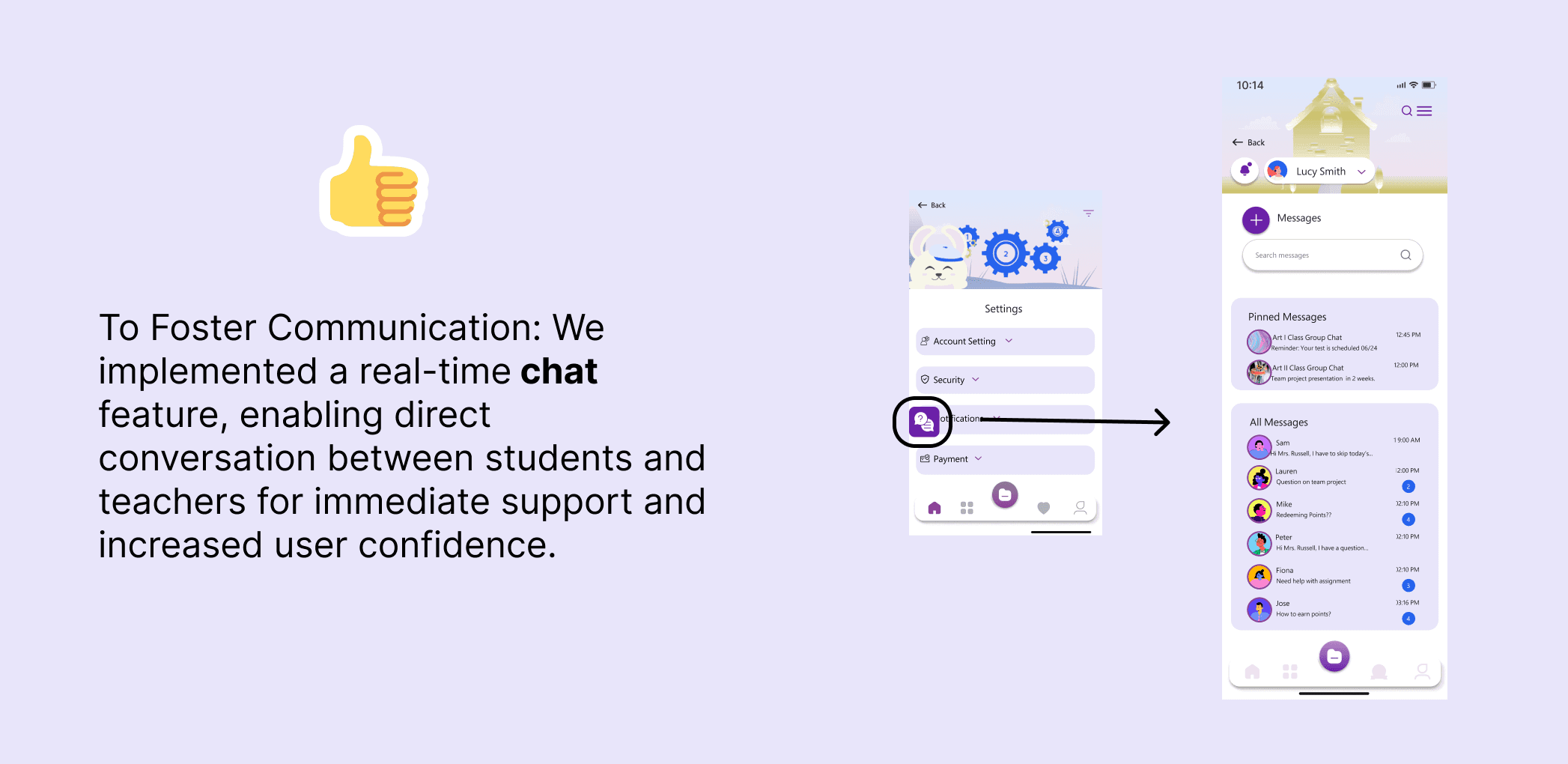
Instant Feedback: A chat function for student-teacher communication.
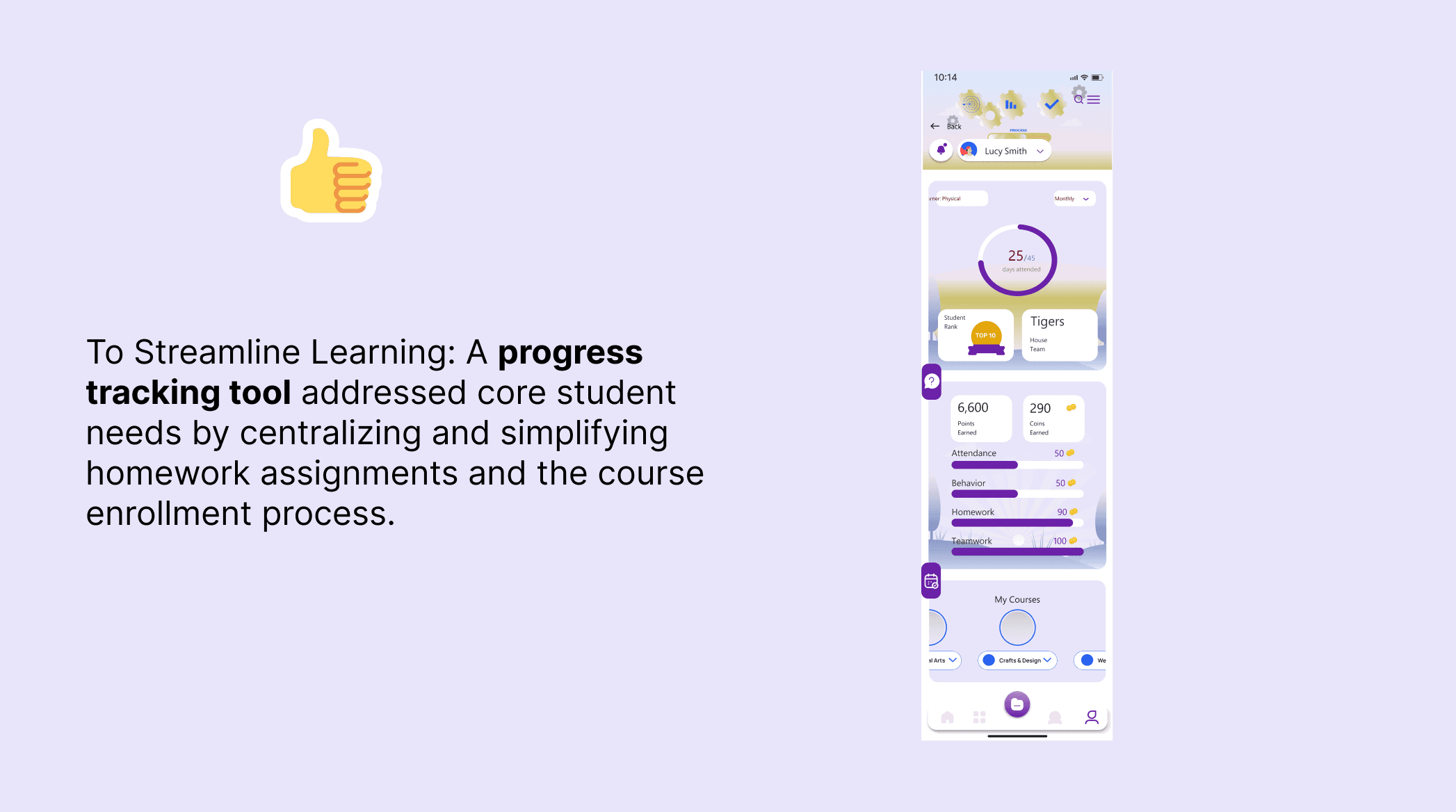
Progress Tracking: A simple tool for managing homework and enrollment.
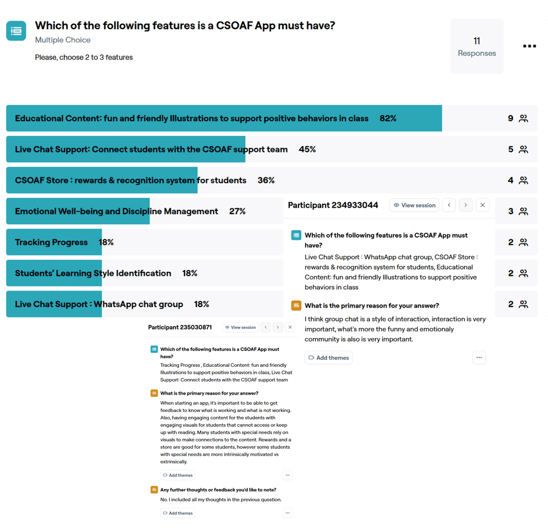
( MVP Maze Survey)
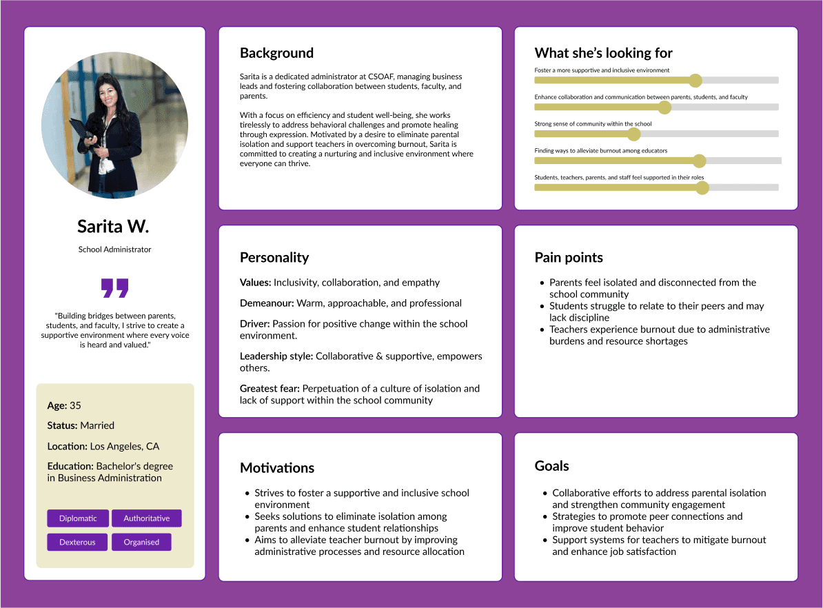
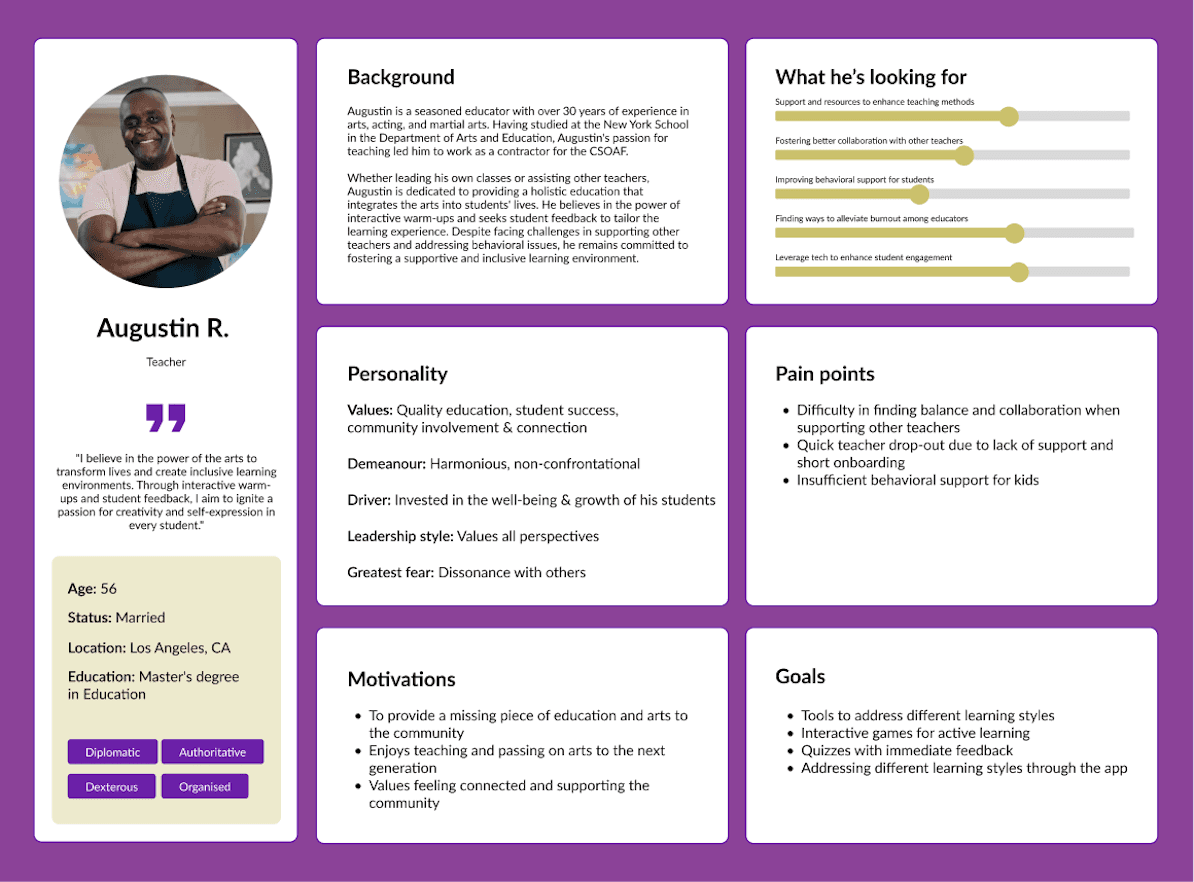
Defining Our Users
Guided by our research, we developed user personas and mapped out their ideal user journeys. I then created low-fidelity wireframes in Figma and collaborated with front-end developers in regular stand-up meetings to iterate on the design solutions.
From Idea to Interface
We turned these ideas into sketches and then digital wireframes.
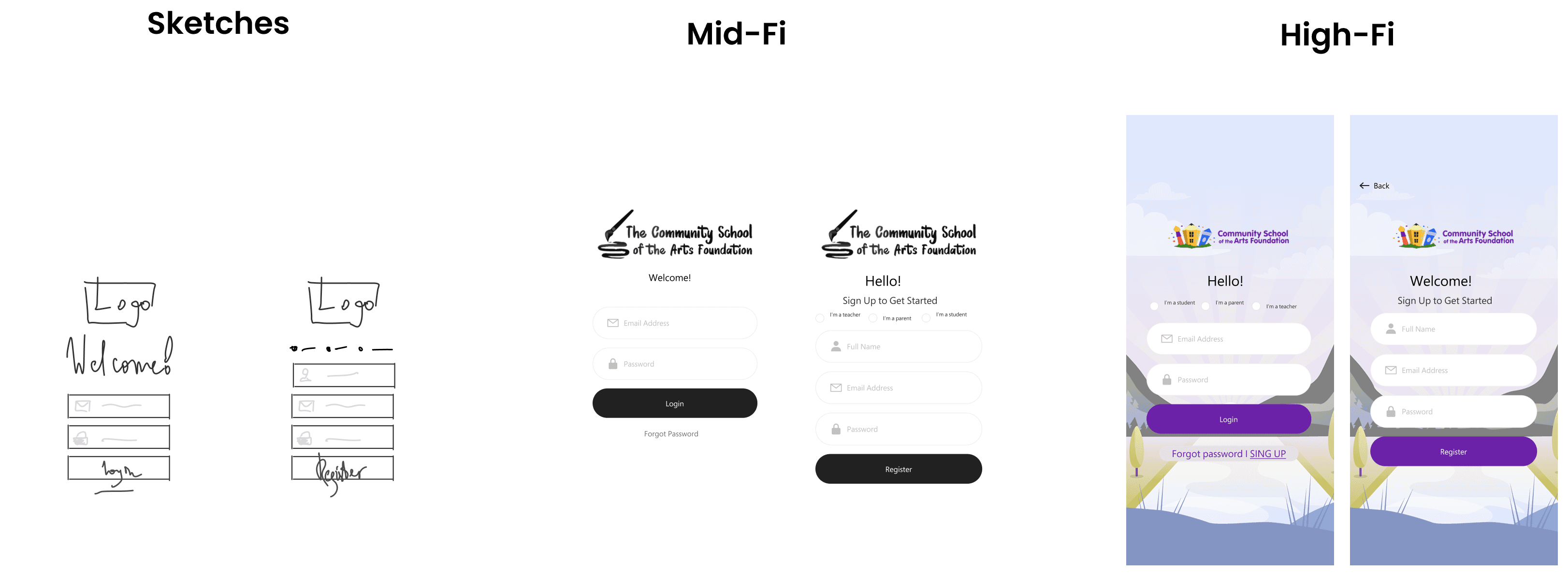
To meet our MVP goals, we focused on three core features designed to enhance communication, organization, and motivation:
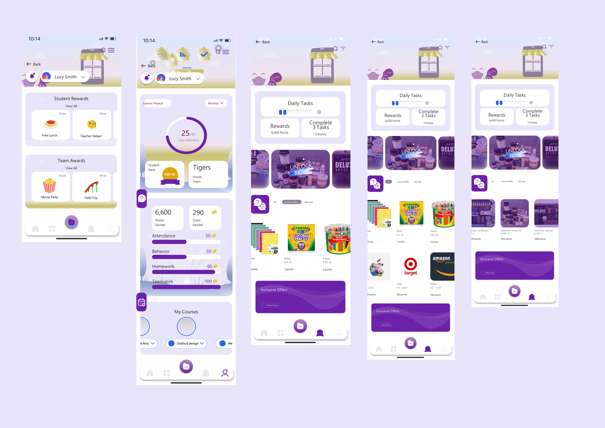
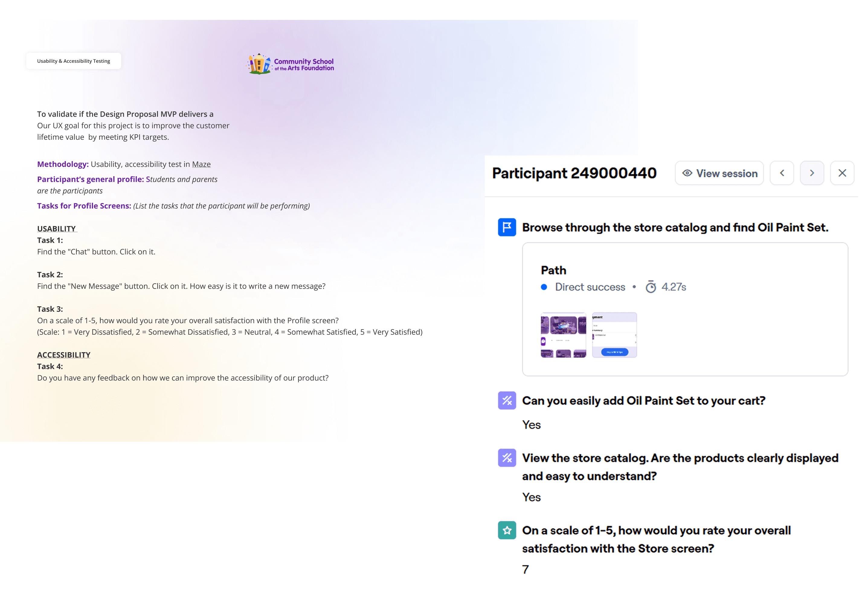
From Ideas to Real Product
We tested our early MVP designs with students and teachers using Maze surveys. The feedback was incredibly valuable and highlighted two key usability problems:
Navigation was confusing: Users struggled to find their profile information.
The "Daily Task" component was overwhelming: Its dense layout caused high cognitive load.
Based on these survey results, I refined the designs:
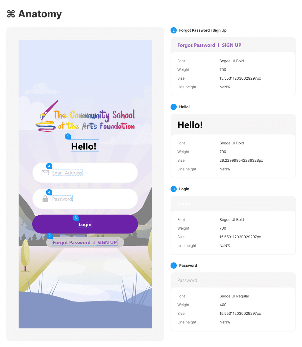
To fix navigation, I implemented a new dropdown button, giving users a clear and intuitive path to their profile.
To fix the clutter, I redesigned the "Daily Task" component, using more whitespace to simplify the layout and improve scannability.
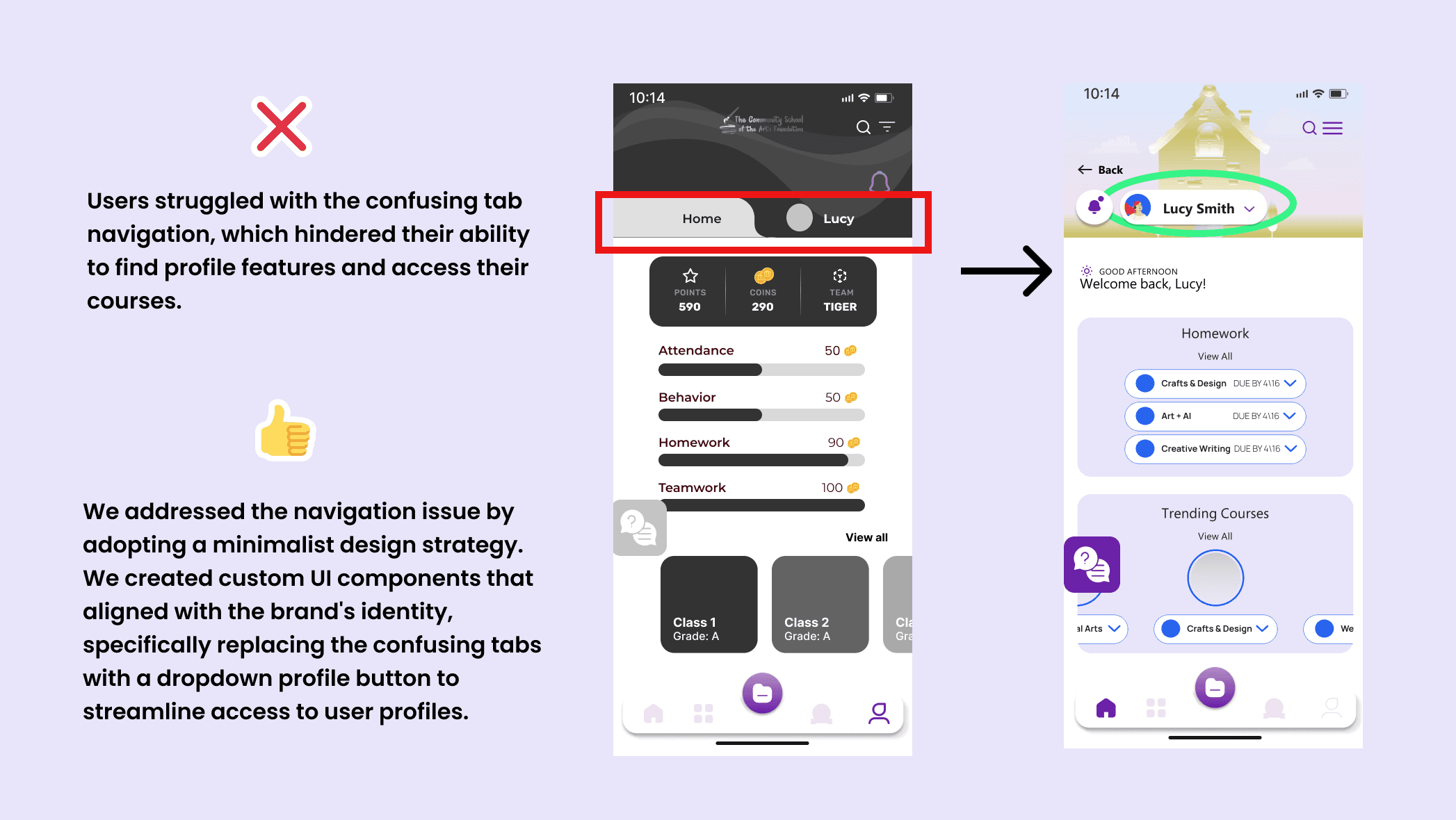
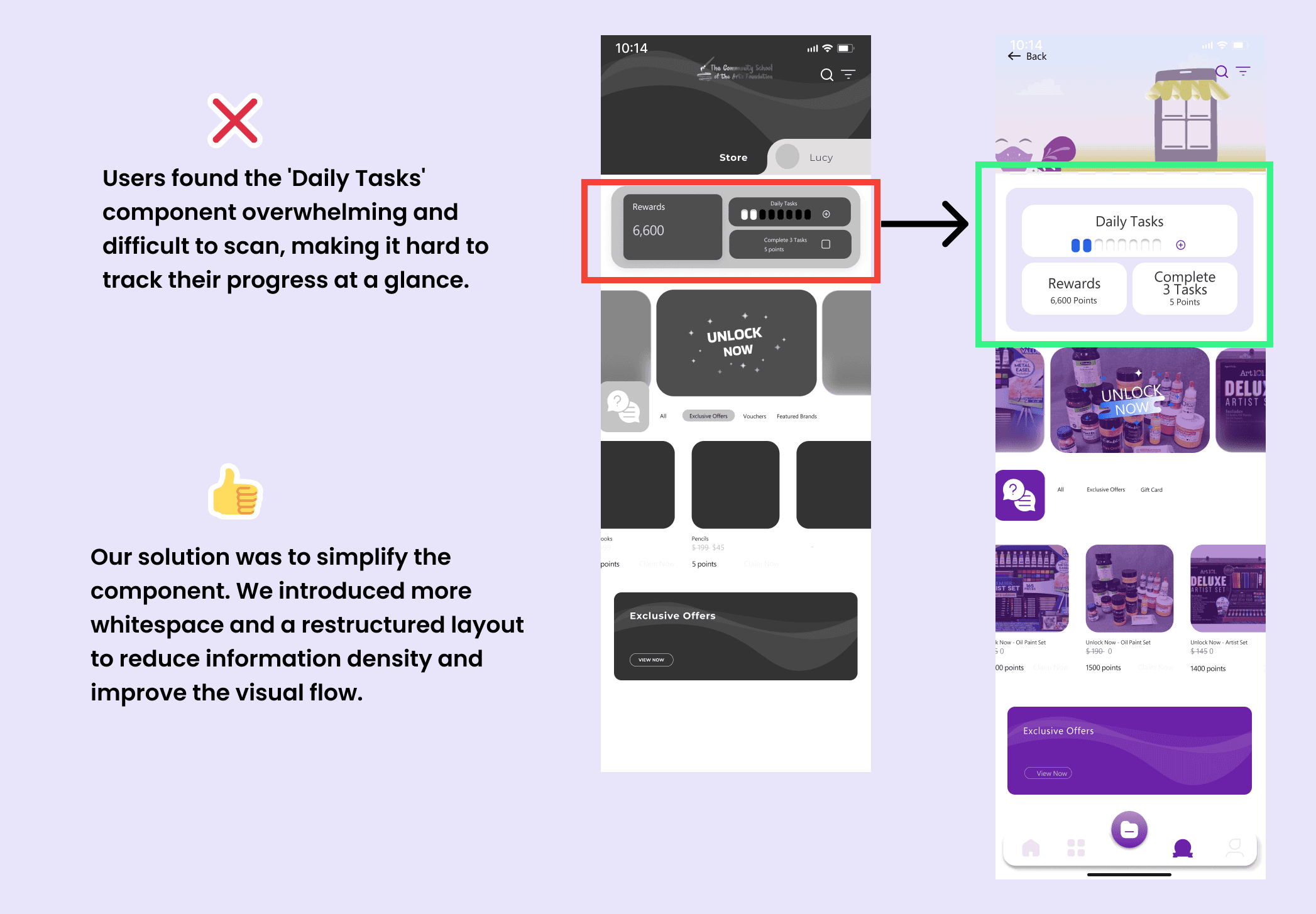
The Result: Follow-up surveys showed these changes were a success. Participants completed tasks much more easily, and we saw a significant increase in our overall user satisfaction scores.
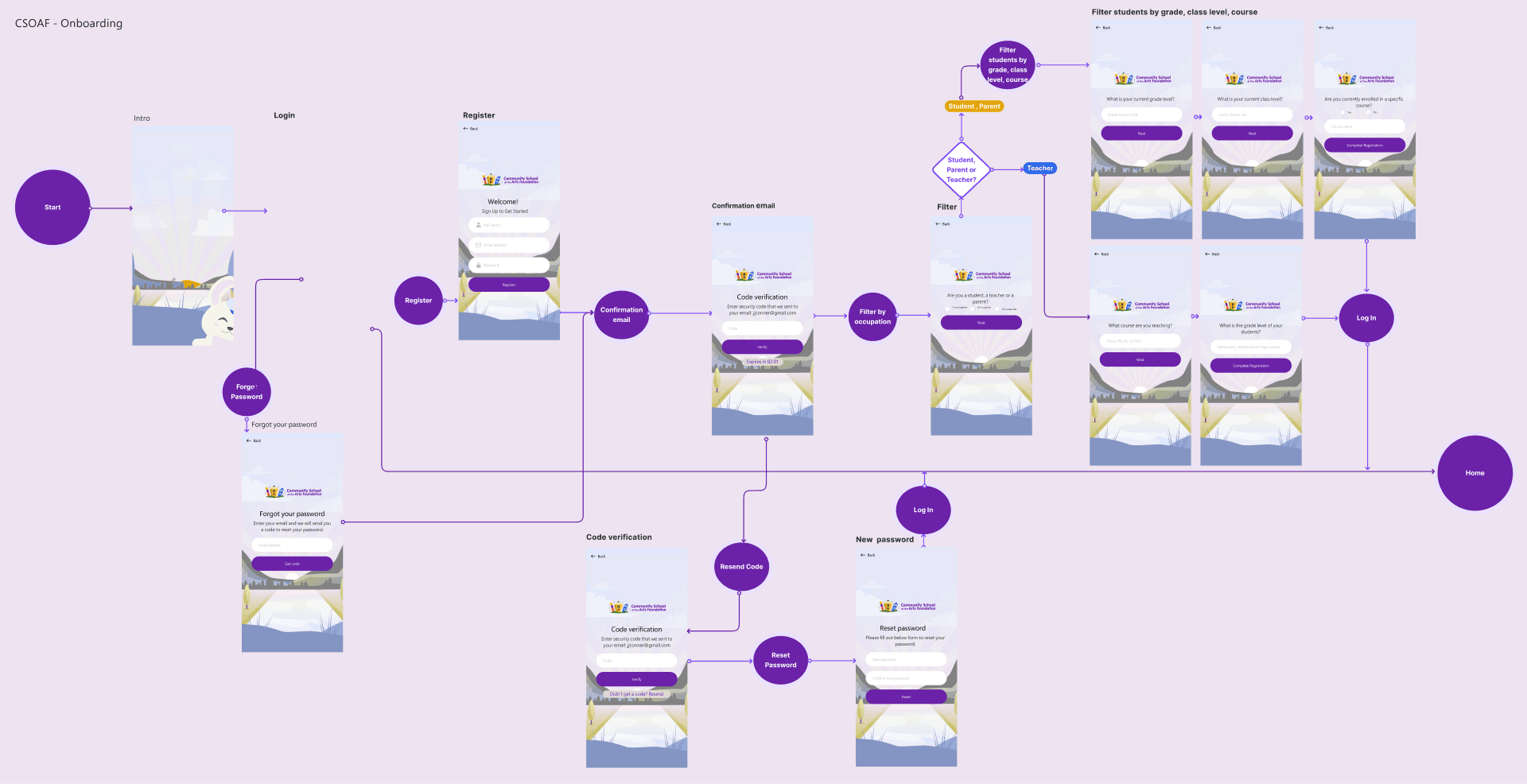
Our Core User Flows
To ensure an intuitive app, we mapped the complete journeys for our two key users. While their paths are similar, each flow is tailored to their specific goals."
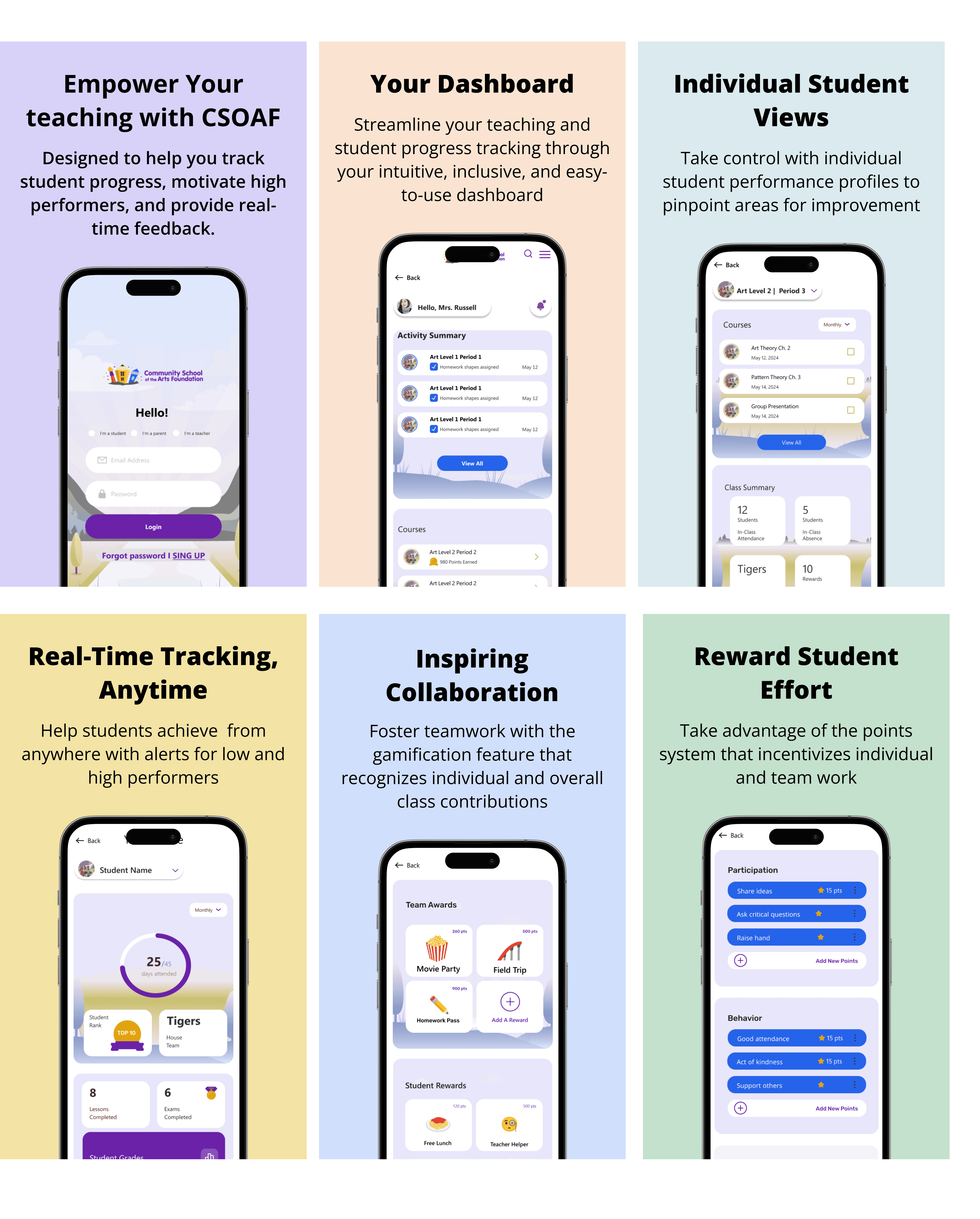
The Student Flow is built for engagement and learning. It focuses on five key areas: Onboarding, enrolling in Courses, tracking progress in their Profile, visiting the rewards Store, and using the Chat for support.
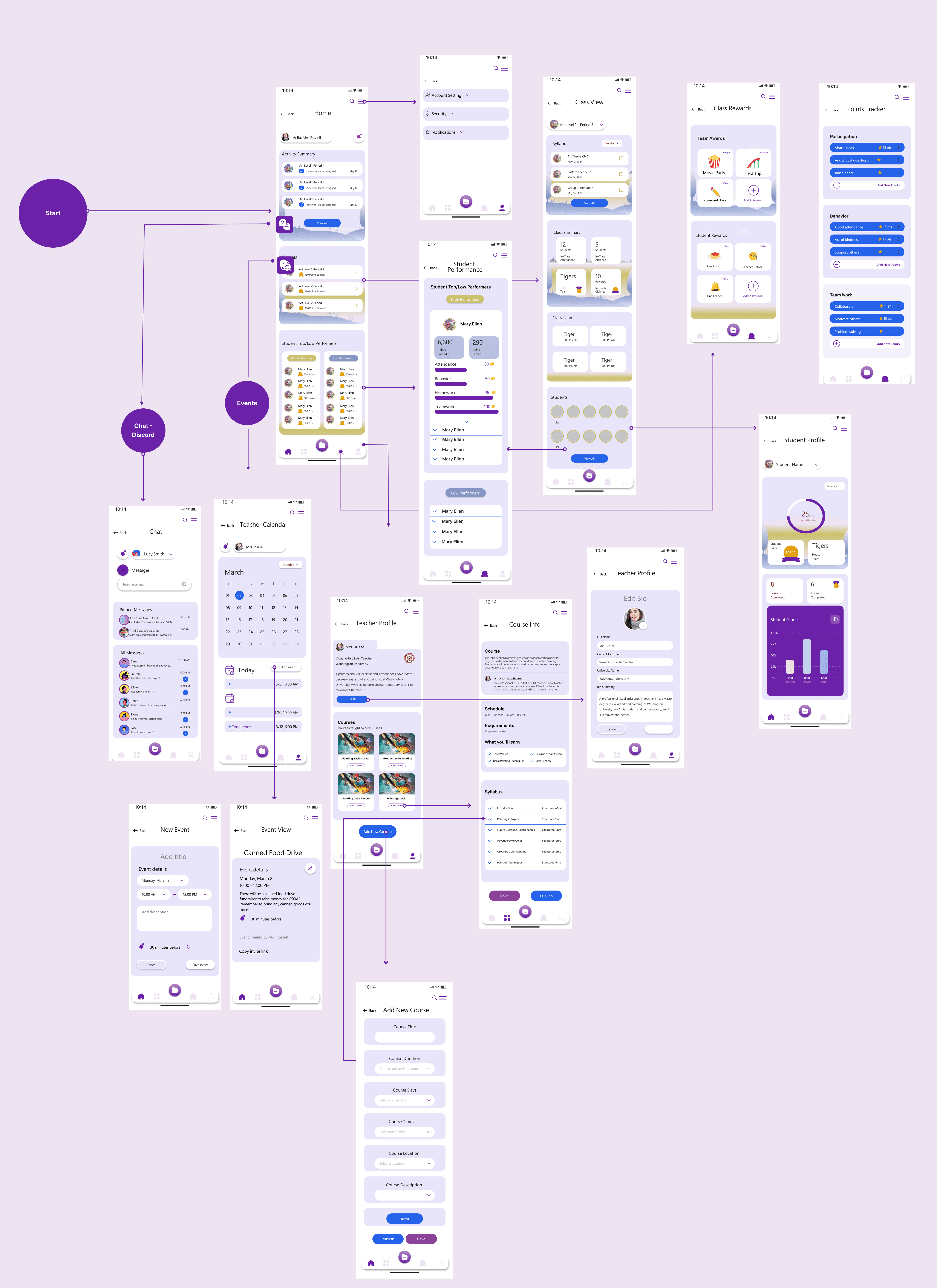
The Teacher Flow is built for management and support. It mirrors the student's features but adds powerful tools, like a points system to manage class rewards and a customized dashboard to review student progress.
The Student Flow
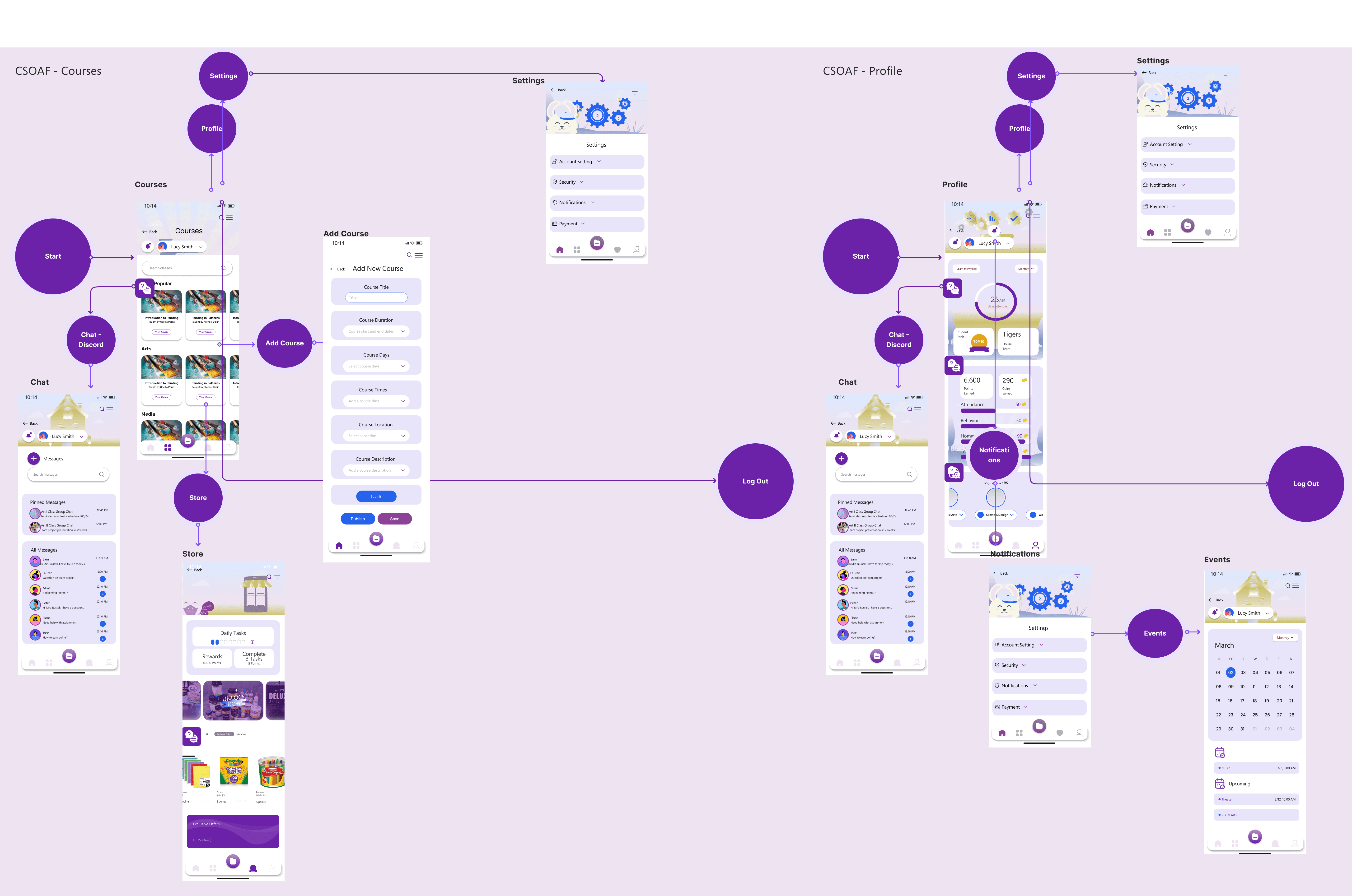

The Teacher Flow
Quality Assurance & Collaboration
To ensure a seamless translation from concept to code, we cultivated a close, collaborative partnership with the engineering and development teams. Our workflow was built on a foundation of open communication, using regular demo presentations and technical meetings to refine the design and align on implementation. This process concluded with a rigorous quality assurance phase(QA), where we validated that the final product met our high standards for usability, accessibility, and an exceptional overall user experience.
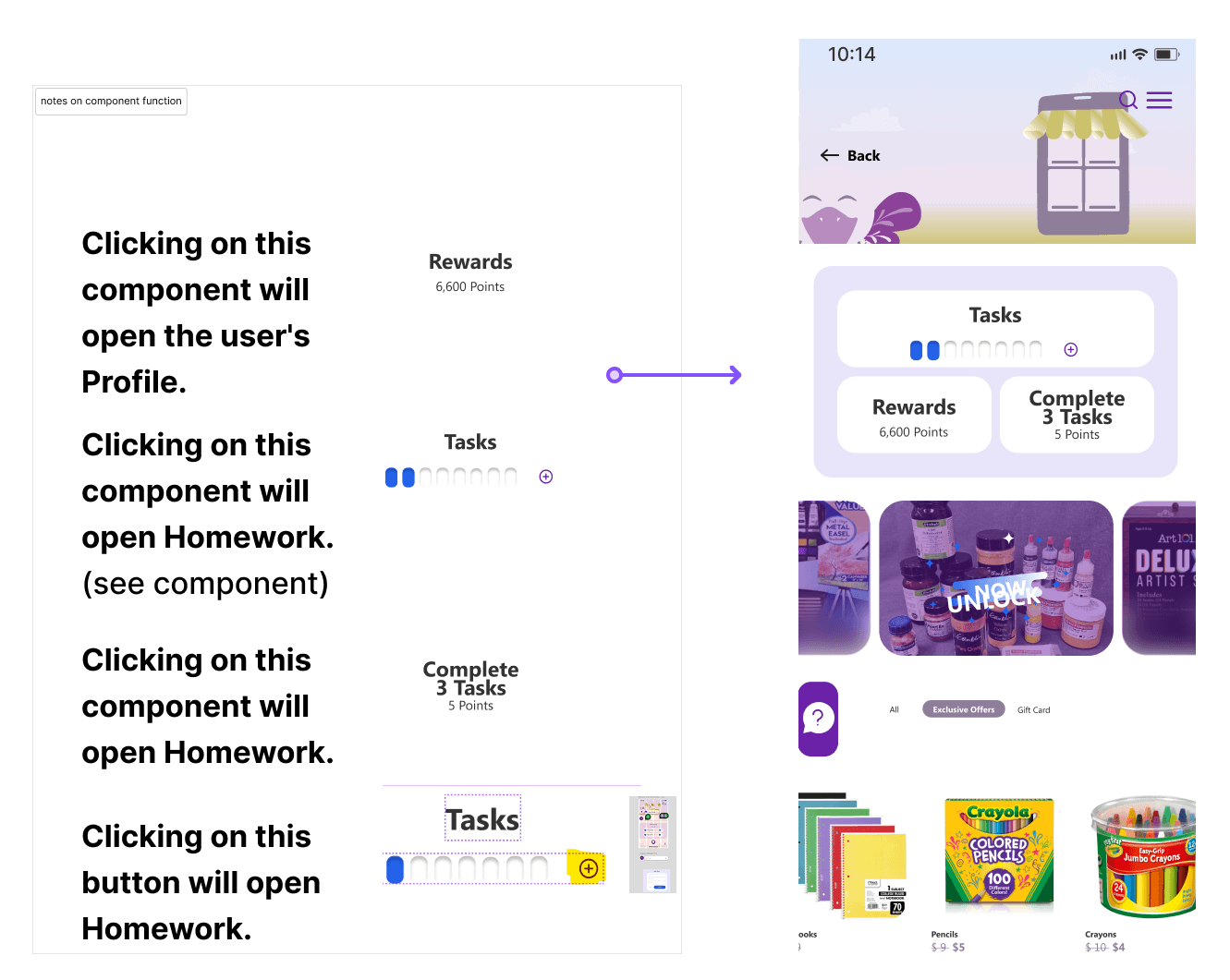
Our initial handoff process revealed a critical gap: our wireframes weren't sufficiently annotated, which created ambiguity for the development team.Our solution was two-fold: first, we supplemented every design file with comprehensive notes detailing feature logic and interactions. we engaged in numerous, in-depth discussions with the front-end developers. This hands-on collaboration was essential for clarifying our design vision and ensuring a much smoother, more accurate implementation.
Go-to-Market: Driving User Acquisition
My contribution didn't stop at the final design. To ensure a successful launch, I created short promotional videos and App Store creatives. The strategic goal was to drive user acquisition by visually communicating the app's core value and inclusive features, setting accurate expectations for new users from their very first touchpoint.
Reflection & Key Takeaways
This project was a powerful lesson in both collaboration and impact. It reinforced the value of a deep designer-developer partnership; overcoming our handoff challenges taught me that daily communication and detailed documentation are the keys to success. It was also incredibly rewarding to see our initial "Aha!" moment about gamification be validated as the app's main driver of engagement. Ultimately, seeing our research-led designs directly cause a 27% jump in user satisfaction and a 33% growth in activity confirmed our strategy was the right one.
Future Considerations
Analyze Post-Launch Data: I would track the long-term retention rates of the gamification features to ensure the "rewards" system remains motivating after the novelty wears off.
Expand Social Features: Currently, the chat is 1-on-1 (Student-Teacher). I see a huge opportunity to introduce "Classroom Forums," which would allow students to unblock each other and build a peer-to-peer learning community.