Foundation on the Rock: Designing with Empathy Under Extreme Constraints
Client
Congregation members
Team
Skills
0 to 1 Product Design, Inclusive & Accessible Design, Cross-Cultural Localization Strategy
Duration
4 Months
The Foundation on the Rock Story
My story begins in Nigeria, with a church organization called 'Foundation on the Rock.' I was tasked with a challenge that seemed almost impossible: how do you bring a community together online when they exist on the other side of a massive digital and linguistic divide?
## Act I: The "Impossible" Challenge
Before I could even think about design, I had to understand the immense constraints we were up against. There wasn't just one problem; there were three huge walls between the community and any digital solution.
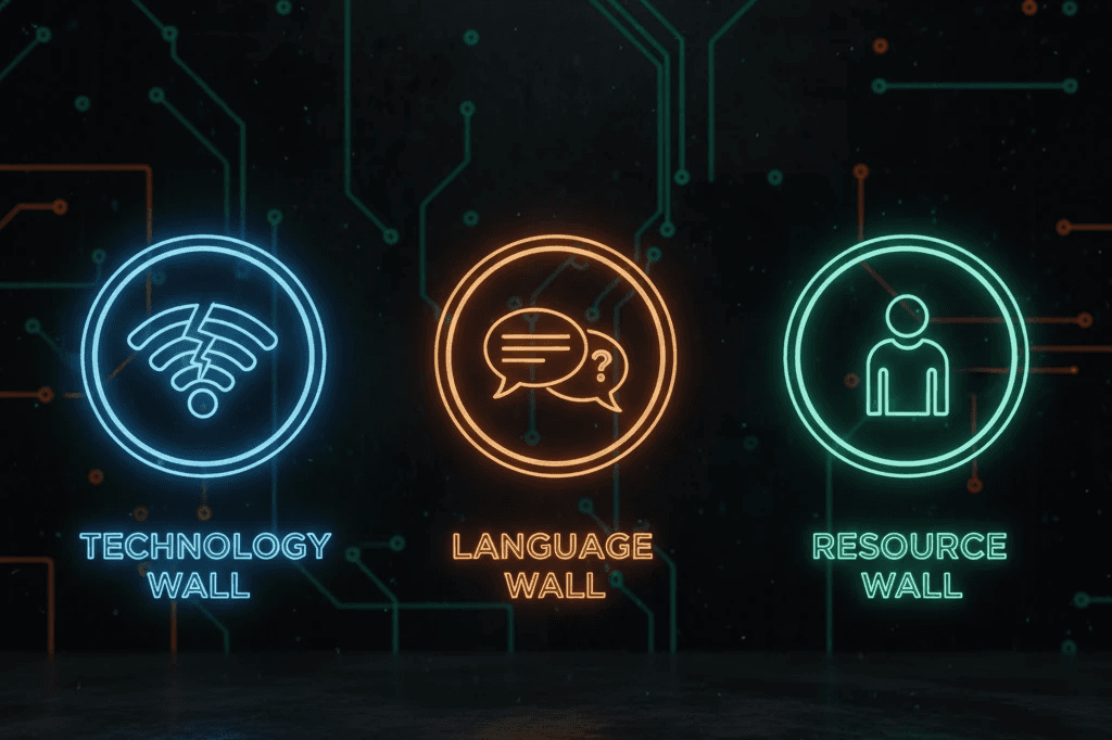
The Digital Divide: First, there was the technology gap. Internet access was limited, and for the vast majority, their only connection was through a mobile phone. This meant any solution had to be incredibly lightweight and work perfectly on a small screen.
The Language Wall: Second, the language barrier. The local language, Yoruba, isn't supported by tools like Google Translate. To make it harder, many of the local pastors had limited English education, making clear communication a major hurdle.
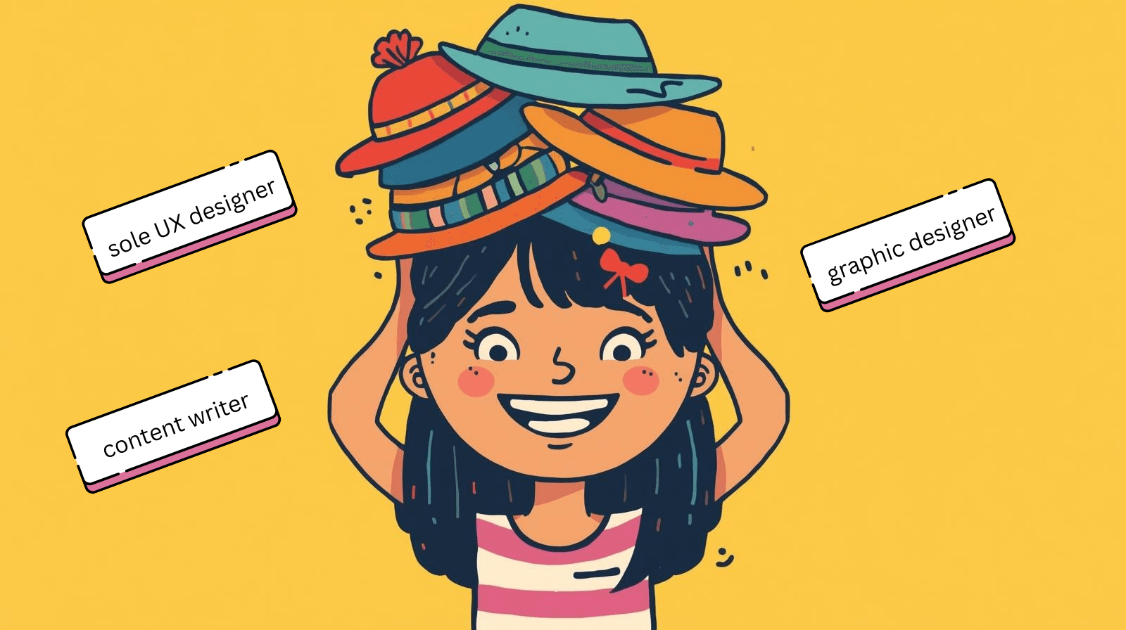
The Resource Gap: And finally, I was the sole designer, content writer, and graphic designer. With limited resources, I knew I had to be strategic and resourceful.
The central question was clear:
How could I, a single designer, bridge all of these gaps to create something truly accessible?
(How I tackle design challenges)
## Act II: The Breakthroughs
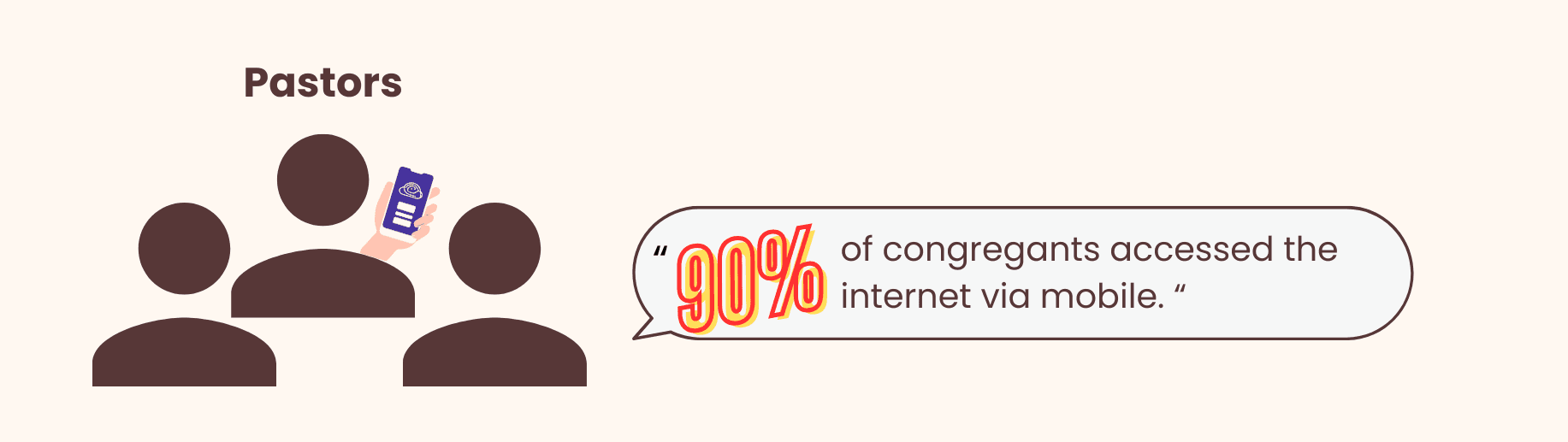
My process started not with design, but with connection. With the help of a translator, I reached out to the local pastors through email to understand their community's real needs.
Communicates with pastors to understand through emails with interview questions, and through translation, I understood that: Mobile is essential: Pastors confirmed that community members accessed the internet almost exclusively via mobile phones.
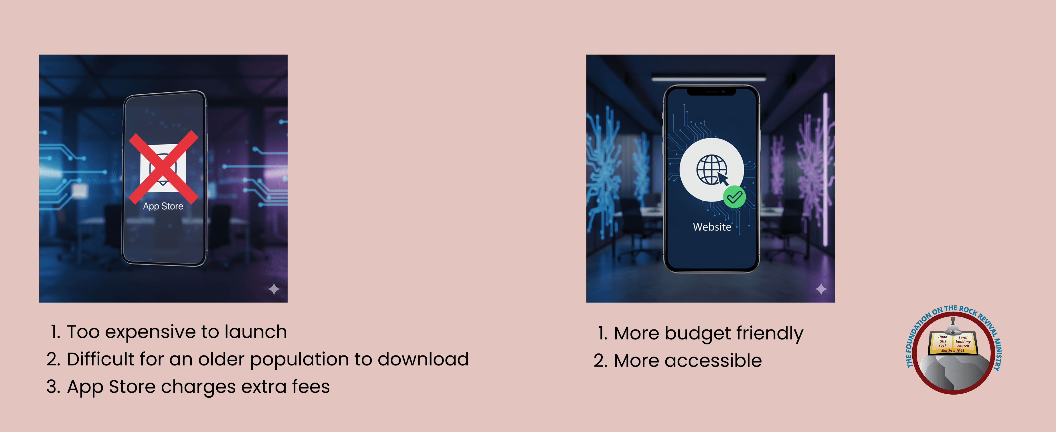
Breakthrough #1: Website, Not an App
The very first insight from my research led to a critical strategic decision. An app was out of the question—it would be too expensive, difficult for an older population to download, and could involve fees. A simple, mobile-first website was the only way to go. It was the most budget-friendly and accessible solution for everyone.
Breakthrough #2: Designing for Culture and Context
With the platform decided, I focused on accessible design. This went beyond just technical standards.
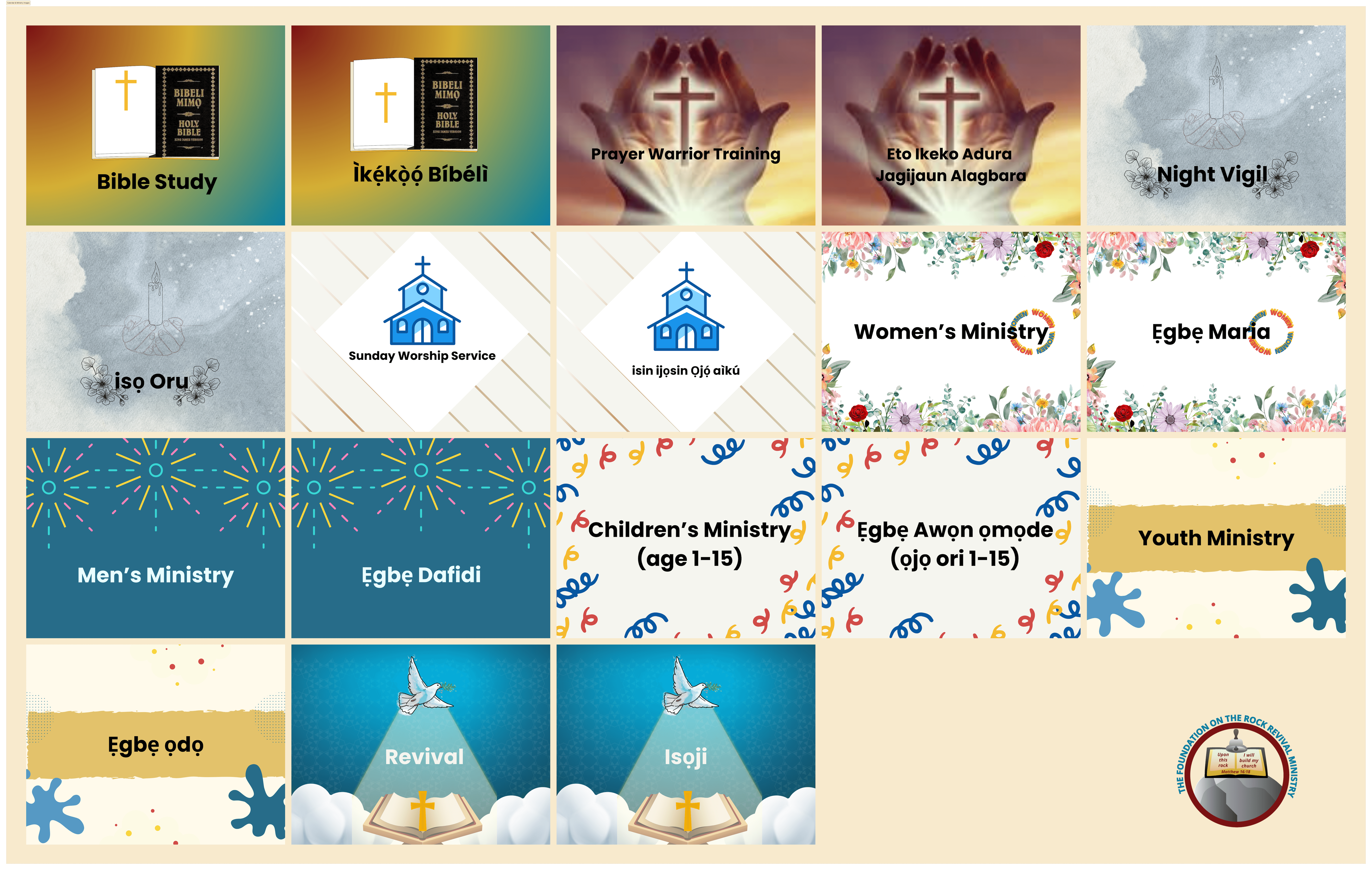
For the culture, I designed simple, high-contrast graphics and icons that were culturally resonant for the Nigerian community:
Using high-contrast color palettes
Employing large, legible fonts and clear iconography
incorporated locally recognizable symbols like an open Bible (emphasizing scripture's centrality) and uplifted hands (a common symbol in Nigerian worship culture).
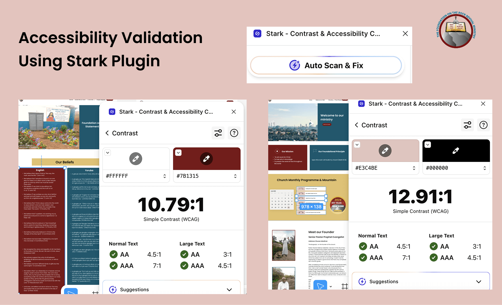
For the context, I followed WCAG 2.1 guidelines to ensure the colors and fonts were legible even on older phones and under bright sunlight.
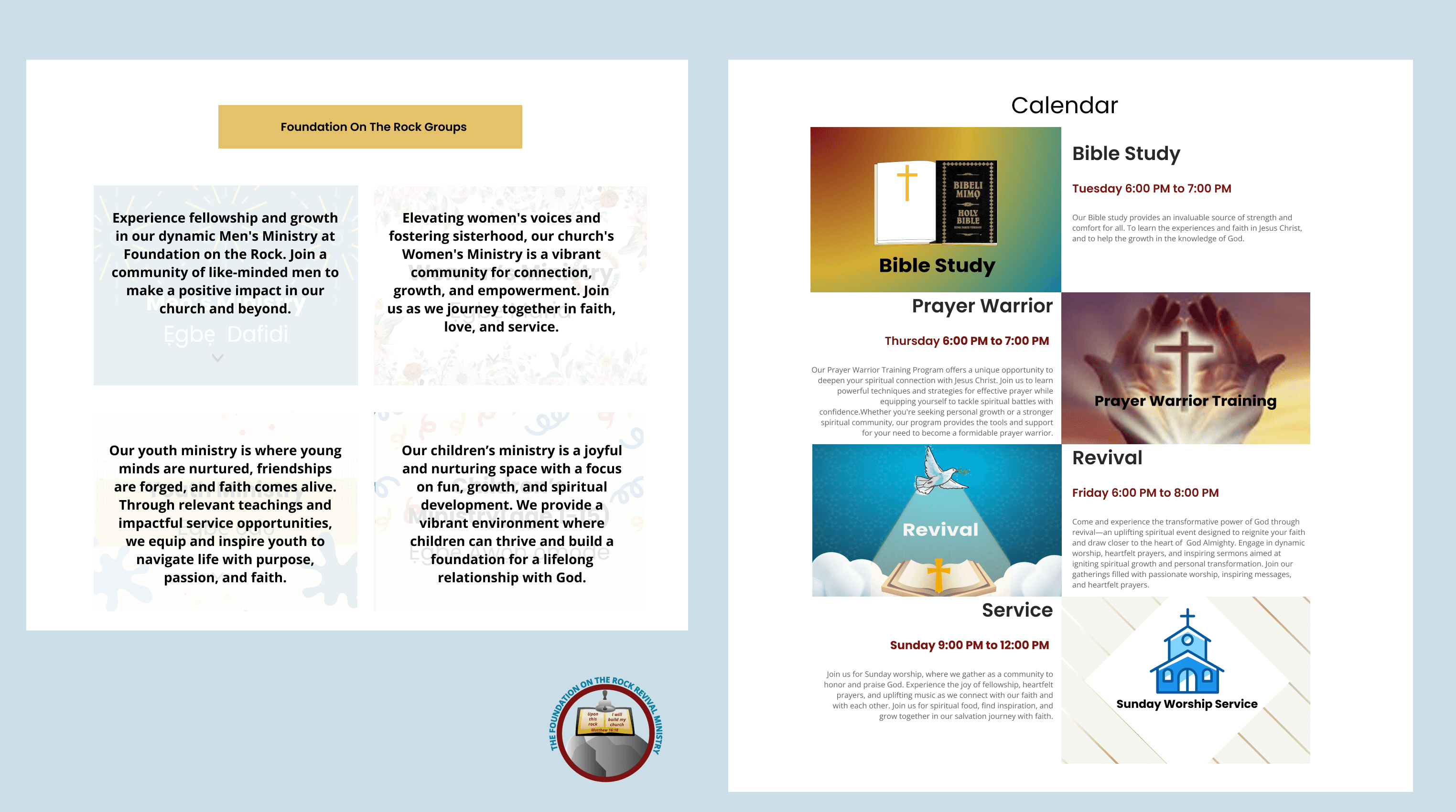
For the promotional content, I crafted accessible, culturally relevant copy for all church communications—including ministries, calendars, and events—and implemented the English-Yoruba translation system to ensure full inclusivity.
The Final Boss: Translating the Untranslatable
Just when the design was coming together, I hit my biggest wall: the content. The pastors' messages were often handwritten in Yoruba and were difficult to read, let alone translate accurately.

(ex of pastors' written notes)
This is where I had to get creative. A simple translation wasn't possible. So, I developed a multi-step system:
First, I used an AI converter tool to transcribe the handwritten notes into digital text.
Next, I worked with manual translators to accurately convert the text from Yoruba to English.
Finally, I used ChatGPT to refine the grammar and flow of the passages, ensuring the pastors' messages were delivered clearly and powerfully.
## Act III: The Resolution & The Moral
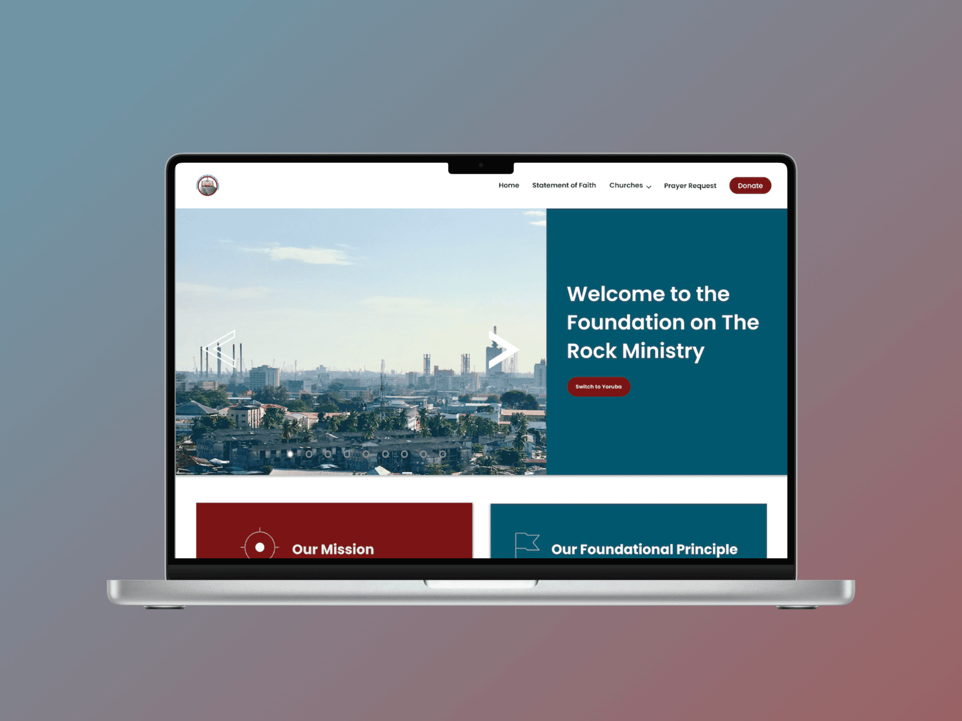
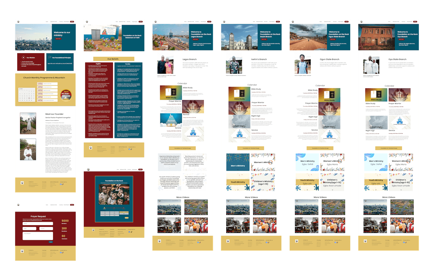
This breakthrough in translation unlocked the final piece of the puzzle. The final product was an accessible, mobile-first website, but the real magic was the language switch button.
This simple feature, powered by a complex and creative translation process, allowed users to seamlessly toggle between English and Yoruba, finally giving them access to their church's content in the language of their heart.

(mobile header)

(website center)
Final Design: The Live Website


(website version)
The website is published on WordPress now. Click here.
The Takeaway:
This project taught me more than just how to wear many hats. It showed me how to design with empathy under extreme constraints. It proved that by creatively combining technology like AI with human connection, we can build meaningful solutions for underserved communities. I wasn't just designing a website; I was building a bridge to connect a community in another country, and that has been one of the most impactful experiences of my career.
What's Next:
Offline Functionality (PWA): Since the internet in the target region is often unreliable, a standard website isn't enough. Converting this into a Progressive Web App (PWA) would allow users to access these critical guides even when they lose their connection.
Voice/Audio Support: User research indicated varying literacy levels across our audience. To solve this, I want to integrate audio narration for the main articles, ensuring the content is accessible to everyone, regardless of reading ability.