Davis Food Snap Food Trail: From Design to Code: A Full-Stack Project
Client
City of Davis
Team
Skills
Front-End Development (HTML/CSS/JS), Interaction Design, Content Strategy & Storytelling
Duration
1 Month

Our inventive creatives immensely delight in fashioning bespoke personas for client enterprises. An unwavering commitment to precision is guaranteed to fulfill our customer's demands. Detail-oriented creativity is our motto.
Our team routinely delivers online solutions with scrupulous accuracy. The prime focus is always on the product to cater to our customer's demands.
The Short Story: I designed and built "Dine & Snap," an interactive food guide for the City of Davis that transforms an overlooked historical landmark into a point of interest. As the sole designer and developer, I took the project from initial research to a fully functional website coded in HTML, CSS, and JavaScript. A critical round of user testing allowed me to pivot and clarify the site's core feature, resulting in a validated and engaging final product.
Key Outcomes:
Launched a live, coded website from scratch.
Clarified a confusing core feature through iterative user testing.
Transformed a civic landmark from an overlooked object into an engaging experience.
The Challenge: The Invisible Landmark
In the heart of downtown Davis sits the Centennial Seal, a landmark rich with local history. The problem? Most people walked right by it, completely unaware of the stories embedded in its design. My challenge was to get people to stop, look, and engage with this piece of civic history in a way that felt natural and fun, not like a history lesson.
The Goal: A Food Guide with a Hidden Purpose
My goal was to design and develop an interactive website that used the universal appeal of finding a great local restaurant as a hook to organically draw people toward the seal and its hidden stories. The project aimed to boost cultural awareness while simultaneously supporting local businesses.
My Process: From Research to Code
My research process was a journey of uncovering the story and identifying the opportunity, piece by piece.
Starting at the Source: My first step was visiting the seal itself. Seeing it in person confirmed my hunch: its historical details were completely lost to passersby. This became the core problem I wanted to solve.
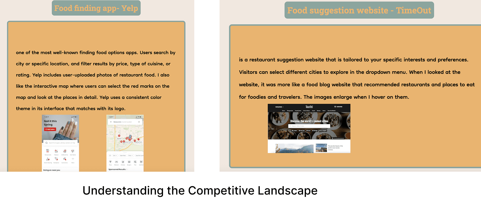
Sizing up the Competition: I then looked at popular apps like Yelp and TimeOut. They were useful for finding food, but felt impersonal and missed the local story. This revealed a clear opportunity for a more narrative-driven guide.
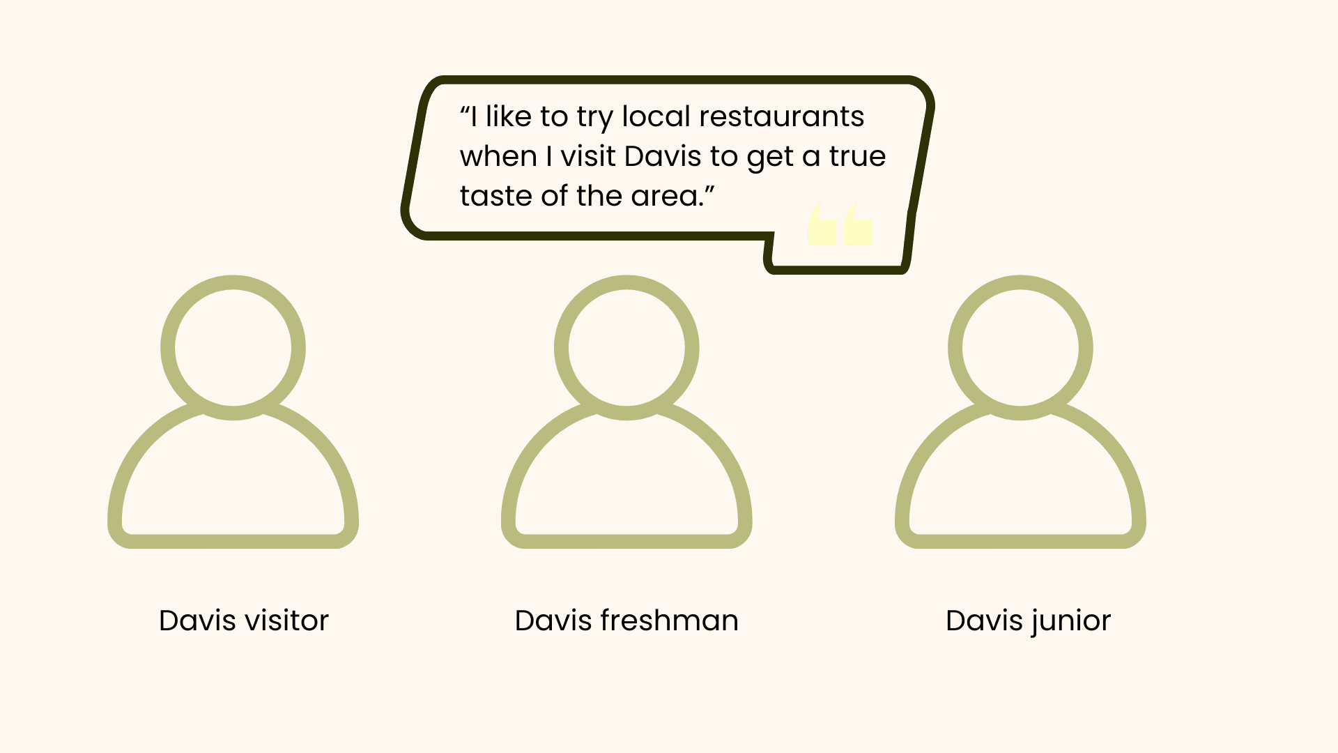
Listening to the Community: Speaking with Davis students and visitors, I heard a common desire for "hidden gems" and frustration with cluttered apps. This feedback directly validated the need for a curated, community-focused experience.
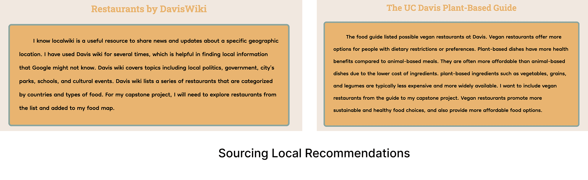
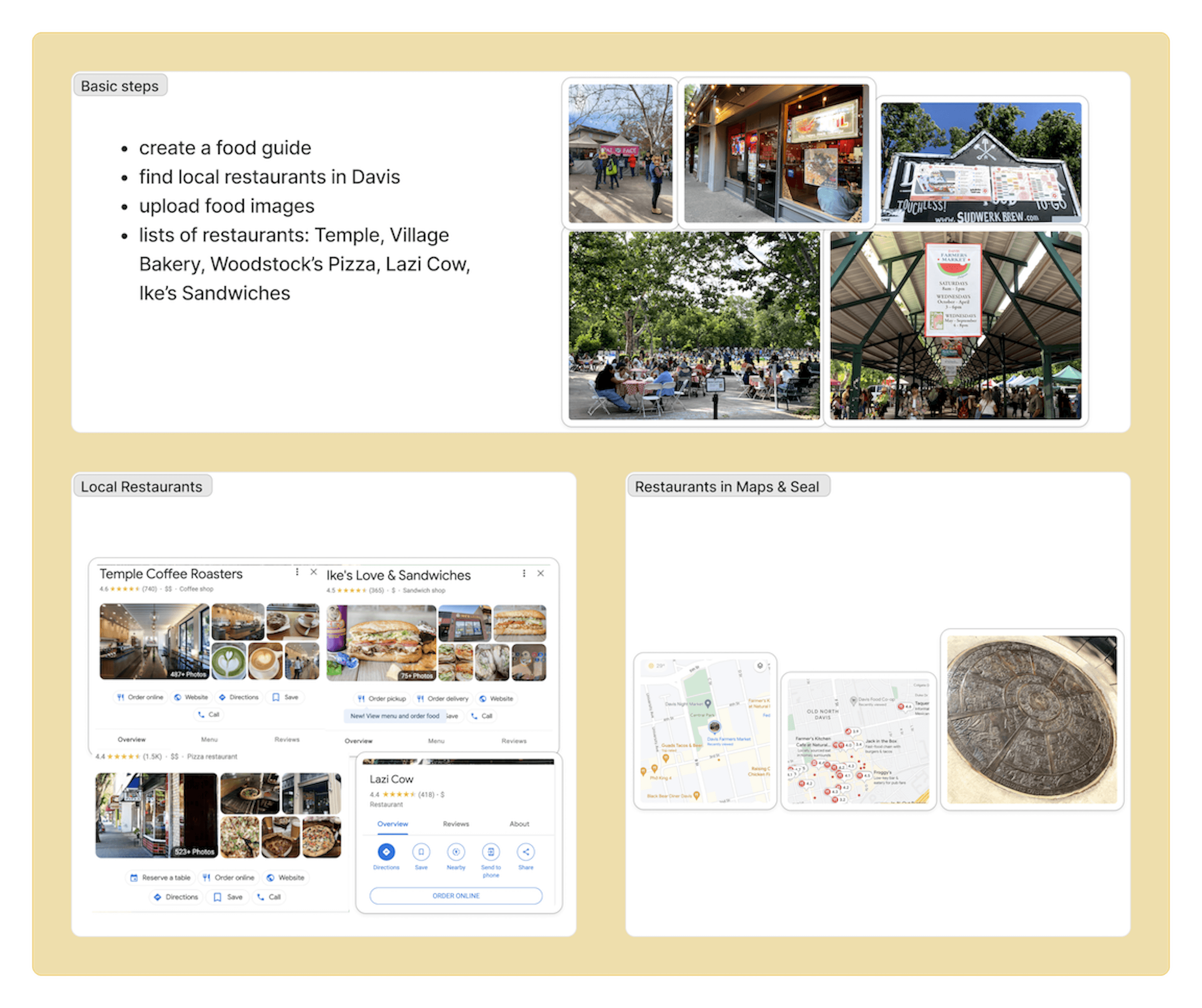
Curating Authentic Content: To ensure the guide was genuinely useful, I dug into resources like the Davis Wiki to find the city's most beloved local and vegan-friendly spots, making sure every recommendation felt authentic.
Visual & Content Research
Throughout development, I referenced guides on healthy and vegan restaurants in Davis. These served as valuable references for structuring content and shaping the food guide's narrative.
Ideation & Design
With a clear understanding of user needs and market trends, I moved into conceptualizing and designing the interactive guide.
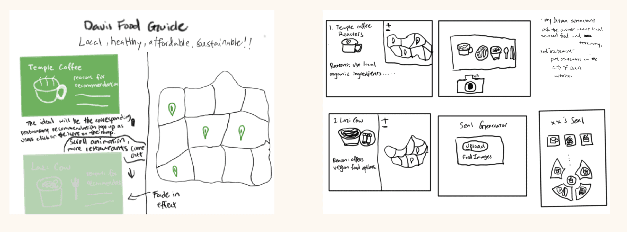
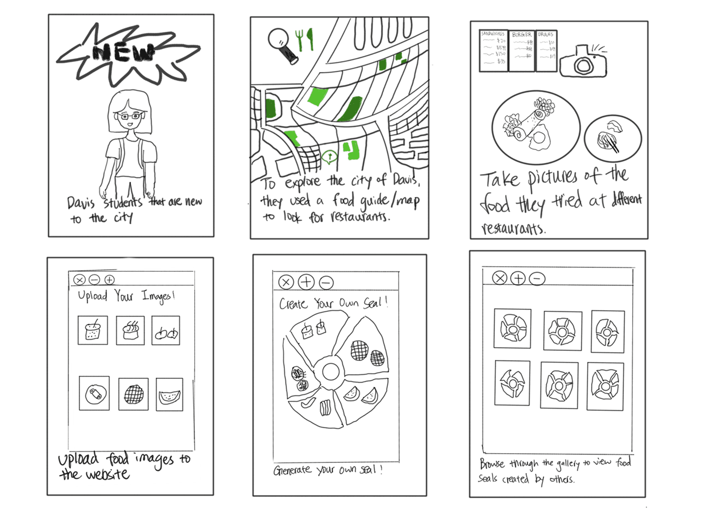
Sketches
I began with rapid sketching to explore initial layouts and user flows for the website, outlining core functionalities and content organization.
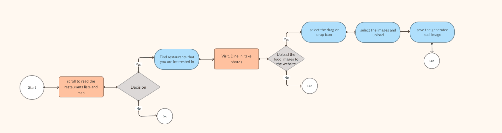
Wireflows & Structure
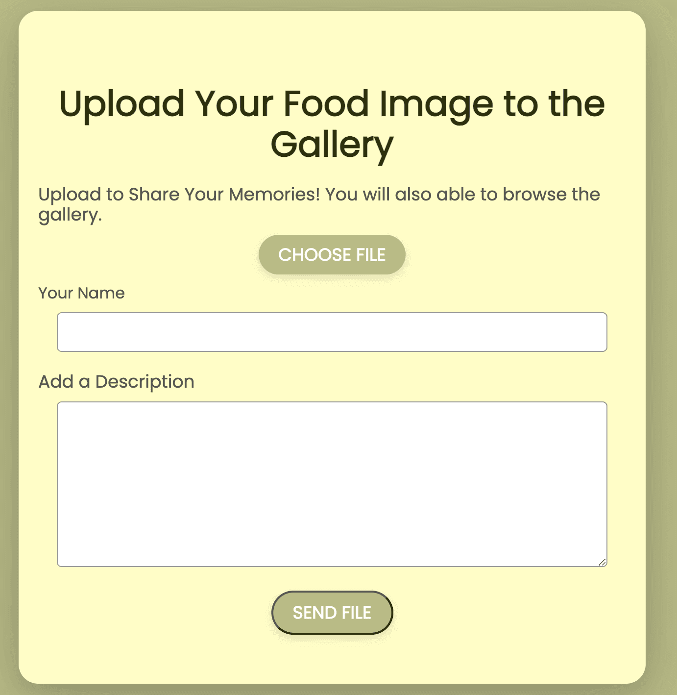
My wireflows prioritized the site's two core features. The interactive map was designed for simple, one-click exploration, while the image upload flow gently guides users to contribute their own photos, fostering a sense of community connection.
User Flow
This user flow visualizes the two primary paths for a user: the journey of discovering a restaurant and the process of contributing a photo to the community gallery after their visit.
Visual Design Principles
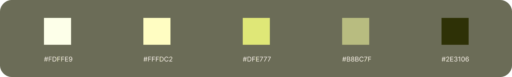
To align with the project's goal of promoting local culture, I chose a color palette of greens and natural tones, reflecting Davis's reputation for sustainability and its agricultural roots. The Poppins font was selected for its clean legibility, ensuring the historical information was accessible and easy to read for all users, a key consideration from my initial research.
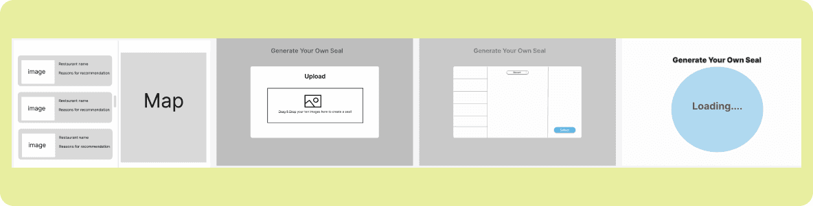
Initial Design Concepts
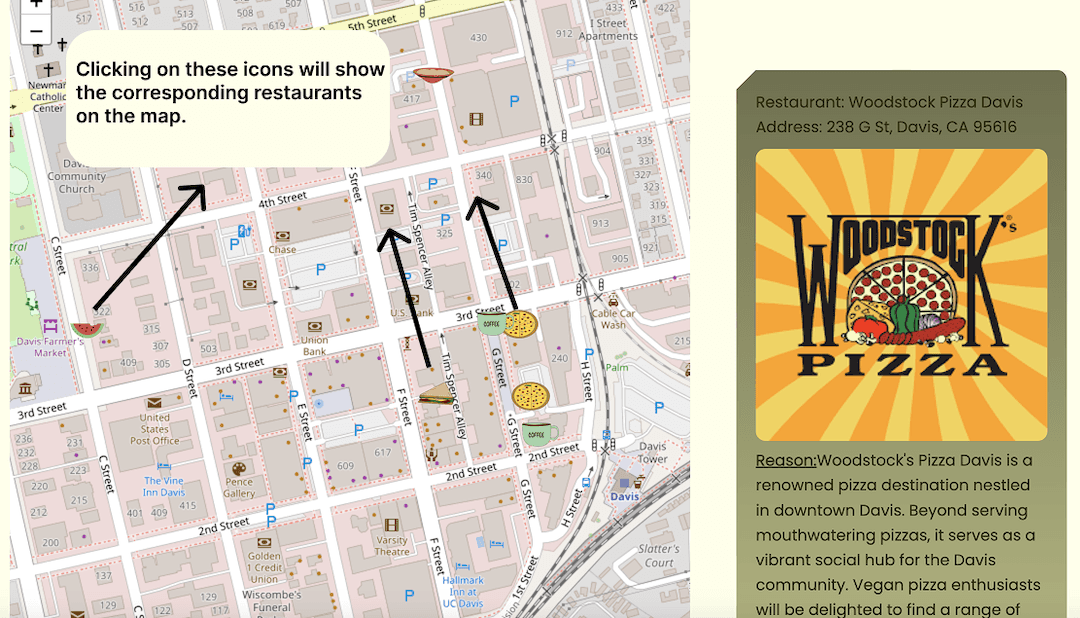
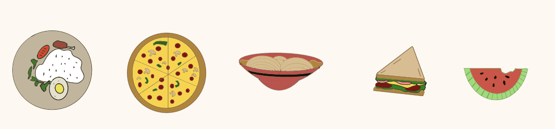
Key design elements included an interactive food map with easily clickable icons, allowing users to explore local restaurants dynamically.
Examples of clickable icons for the interactive food map feature
Development & Implementation
Taking a hands-on approach, I brought the designs to life by implementing the website using front-end coding languages.
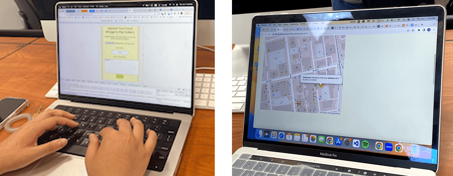
Interactive Map: Developed an interactive map feature using JavaScript, enabling users to explore local restaurants seamlessly.
Image Upload Library: Implemented an image upload library using JavaScript, allowing users to contribute their own visuals and fostering a dynamic, user-centric platform.
This direct development work not only showcased my programming skills but also ensured precise execution of design details and enhanced the website's overall functionality.
User Testing & Iteration
I conducted two rounds of user testing to validate designs and ensure an intuitive user experience.
I conducted initial user testing on a series of paper prototypes, tasking participants to navigate them without instructions.
(paper prototypes in digital form, paper were demonstrated in class)
Key Findings: Users expressed confusion about the "Connect to the Seal" feature. They didn't understand its purpose or how it related to the restaurants.
The Iteration: From Confusion to Clarity
Based on this direct user feedback, I implemented a series of targeted design changes to address the issues:
Added Explanatory Content: I wrote and added a clear, concise summary explaining how the project connected to the Davis Centennial Seal, providing users with the context they were missing.
Reduced Cognitive Load: To present this new information without overwhelming the user, I designed a folding button (accordion). This allowed the detailed explanation to be collapsed by default, letting curious users expand it while keeping the main interface clean.
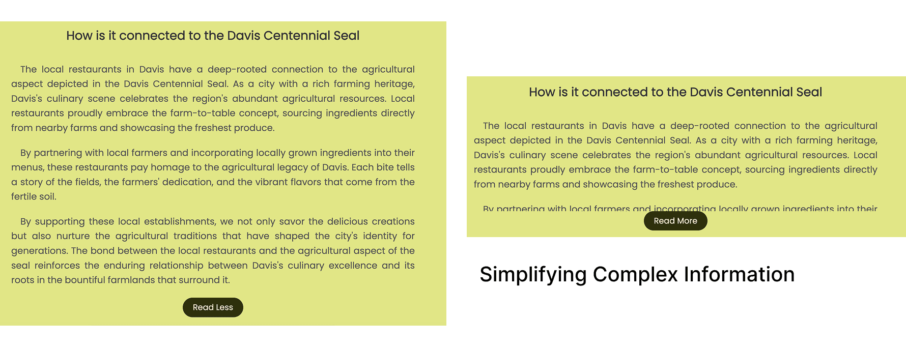
Improved Interaction Design: To enhance the user experience, I added a smooth animation transition to the folding button, creating a more polished and responsive feel.
The Outcome: Validated Design
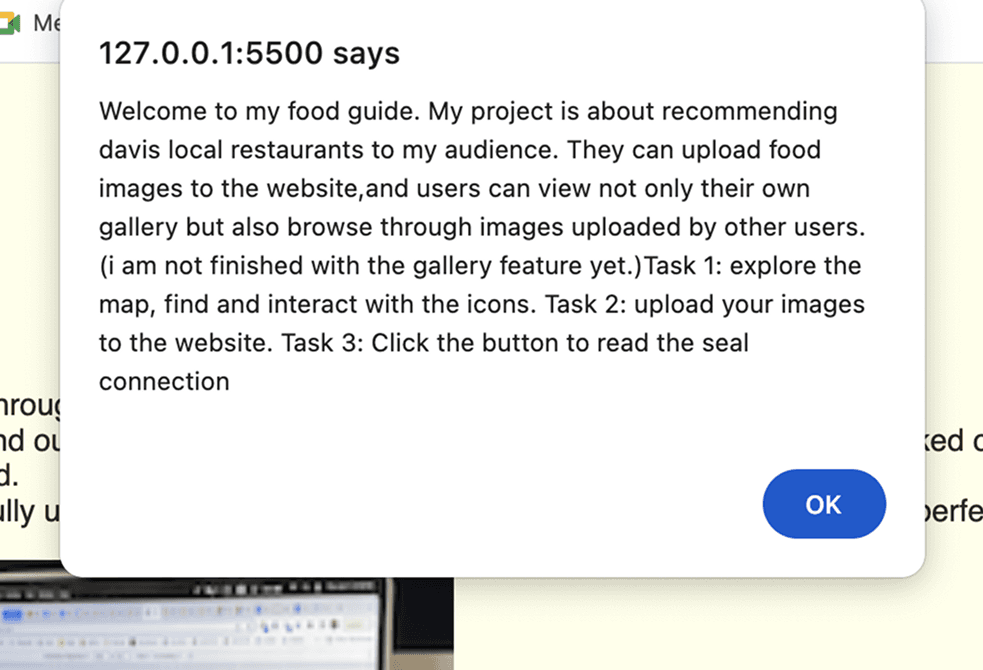
In the second round of usability testing on the live, coded website, I outlined a series of sequential tasks. Participants were instructed to follow the steps in the provided notes sequentially. Users successfully navigated and understood the "Connect to the Seal" feature.
Impact
"Dine & Snap" successfully transformed an overlooked landmark into a point of interest, giving the City of Davis a creative tool to boost cultural awareness while supporting local restaurants. This project showcased my ability to manage an entire product cycle, from ideation to a fully coded and user-validated website.
Personal Reflection
This solo project was an invaluable experience in owning the entire UX and development pipeline. It reinforced how crucial direct user feedback is for clarifying a concept and taught me how to balance a design vision with the practical realities of front-end development.
Future Considerations:
Building a real Backend: Static sites are fast, but they can't remember a user. If I have more time for this project, I want to hook this up to a Node.js/MongoDB database to let people save their Must-Try lists or favorite spots.
Letting users drive: I don't want to be the only one curating the food. I’d love to build a feature where users can upload their own "Snaps" and reviews, turning this from a guide into a living social platform.

