
Spending Buddy: Designing a "Buddy," Not a Boss
Client
College Students
Team
Skills
User Research, Wireframing, Prototyping, User Testing, and Visual & Interaction Design
Duration
1 Month
In the sphere of pictorial depictions and inked masterpieces, the phrase avant-garde denotes a genre of art, an innovative success, and the creative painter, typically characterized by its visual novelty, although often meeting with swift rejection from the prevailing art community of the era.
Overview:
I co-designed "Spending Buddy," a conceptual budgeting app to help college students manage "unconscious spending." Through competitive analysis, student surveys, and iterative user testing, we designed a simplified prototype. Our user-centered refinements led to a final design with an estimated 60% reduction in usability issues.
Key Outcomes:
60% Estimated Reduction in Usability Issues
Key Feature: A unique in-app "Advice Page" to build financial literacy.
User-Validated navigation and a simplified feature set.
The Challenge: From Cafeteria Swipes to Financial Anxiety
For many college students, financial independence arrives overnight. This quickly leads to "unconscious spending"—the daily coffees and late-night food orders that add up, causing stress and derailing financial goals. The core problem is that traditional budgeting apps are too complex, making a bank account feel more like a mystery than a tool.
The Goal: Clarity, Not Complexity
Our goal was to design a simple, encouraging budgeting app that not only tracks spending but also builds financial confidence for students with little to no prior experience. We set out to design a "buddy," not a bossy calculator.
Sizing up the Competition:
We began by conducting a comprehensive competitive analysis of popular budgeting apps such as Mint and Every Dollar. We found they were powerful, but often overwhelming for a beginner.
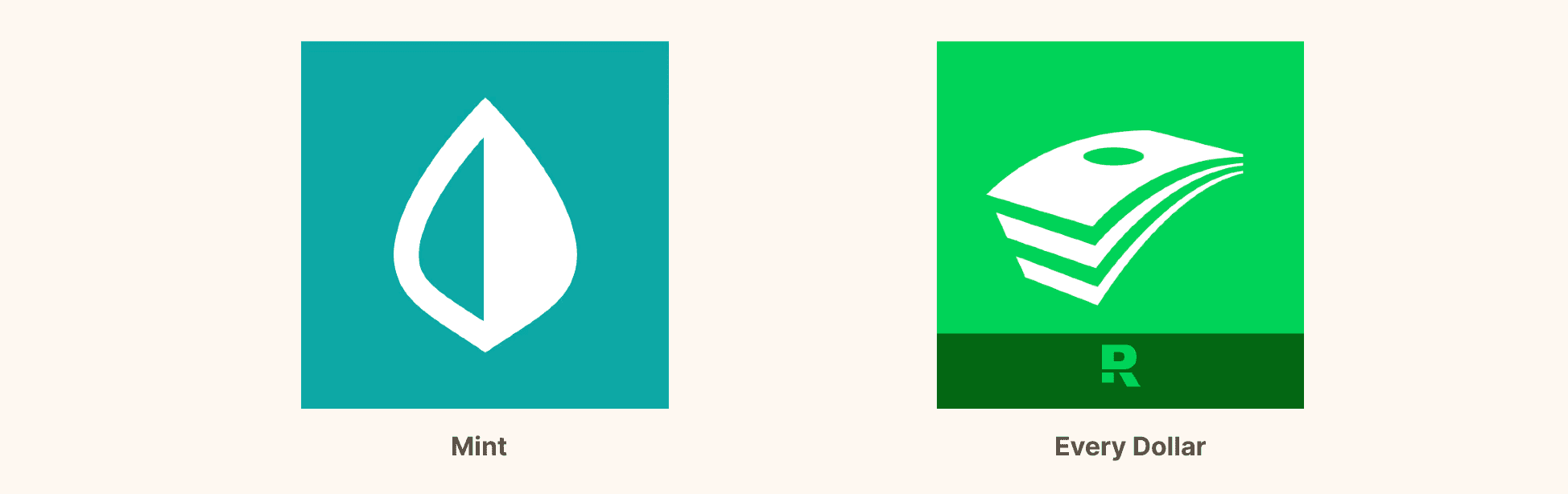
Mint | Every Dollar |
|---|---|
Strength: Provides a detailed overview of spending habits. | Strength: Offers a straightforward budgeting process. |
Weakness: Lacks historical overview and analysis of previous months' spending. | Weakness: Confusing layout and setup process, not beginner-friendly. |
User Interface and Experience: Assessing the intuitiveness and usability of the app's design.
Feature Set: Identifying key functionalities such as budgeting tools, spending analytics, and goal setting.
User Feedback: Analyzing user reviews and ratings to understand common pain points and appreciated features.
Listening to Students
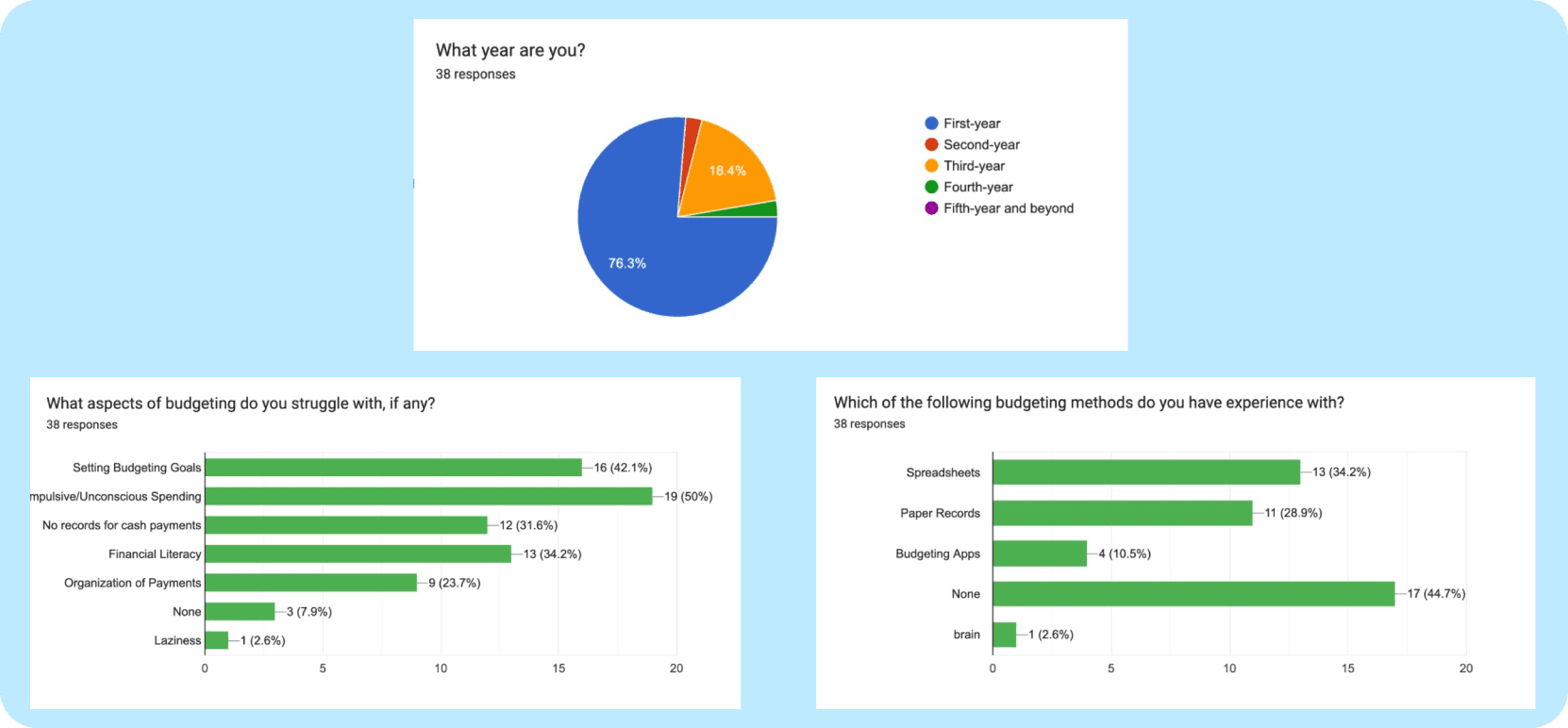
Next, we surveyed 38 UC Davis students. The results were clear:
Most had little to no budgeting experience.
They struggled with unconscious spending and sticking to goals.
They simply wanted a way to keep track of their purchases without a steep learning curve.
This research was our foundation. We weren't just building a budgeting app; we were building a confidence-booster for students new to managing their own money.
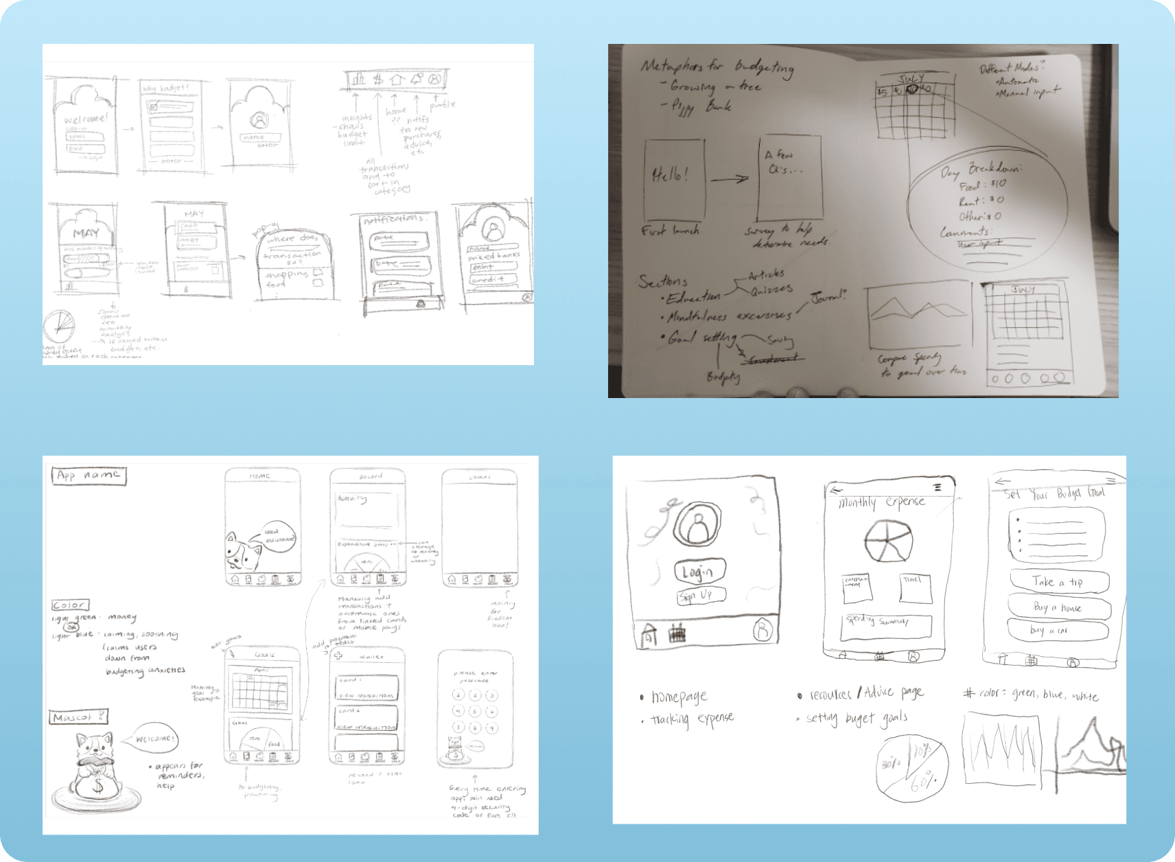
Initial Separate Ideation
Our brainstorming sessions, both individually and as a team, led to several overlapping core ideas:
Intuitive pages featuring spending/expense charts and graphs
A streamlined login/sign-in process.
Designing a "Buddy," Not a Boss
Our research showed students felt inexperienced and wanted guidance, so we knew our app needed to be more than just a calculator. We brainstormed features that would feel approachable and genuinely helpful, not bossy or complicated.
We built our mid-fidelity wireframes focusing on these key ideas:
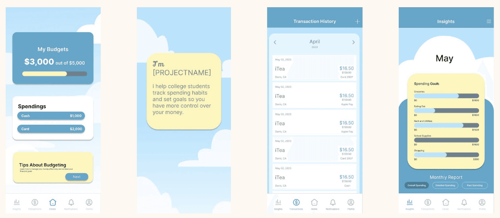
A Simple Dashboard: For a quick, at-a-glance financial overview.
Clear Insights: Monthly reports designed to celebrate progress and build positive momentum.
Easy Transaction History: A straightforward log to help users connect their daily spending to their long-term goals.
A Key Differentiator: The "Advice Page"
Based on our research, our core feature was a dedicated "Advice Page." This in-app resource hub offered simple, actionable tips on saving and building good financial habits. It transformed Spending Buddy from a simple tracker into a true learning tool that addressed the root of our users' problem: a lack of experience.
By including the advice page, we consciously designed a solution that addressed the root cause of our users' challenges—a lack of experience—empowering them with knowledge to build lasting financial confidence.
Learning from a "Hot Mess": How User Testing Saved Us
We put our initial designs in front of 5-6 students, asking them to perform simple tasks like creating a budget. The feedback was humbling and incredibly valuable. To put it simply, our navigation was a bit of a mess. Users felt trapped on certain screens and couldn't easily go back.
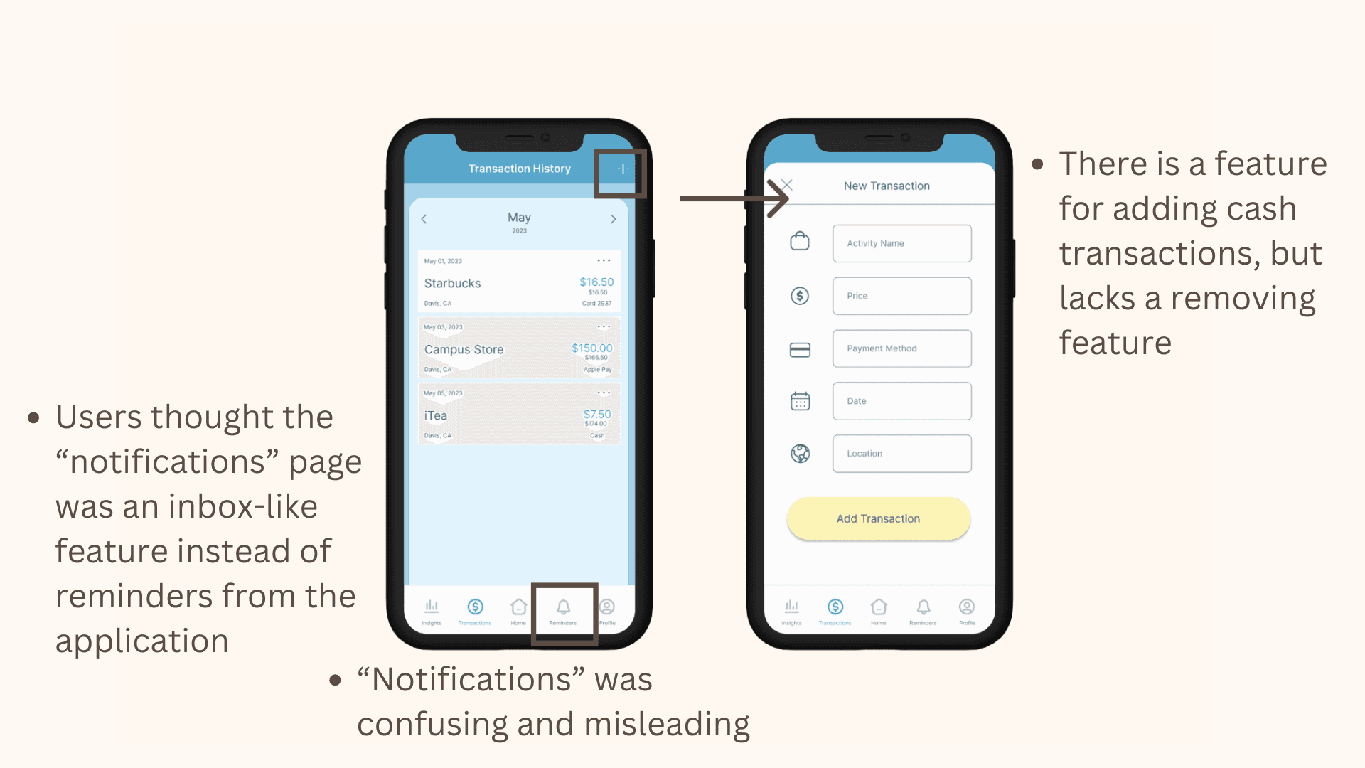
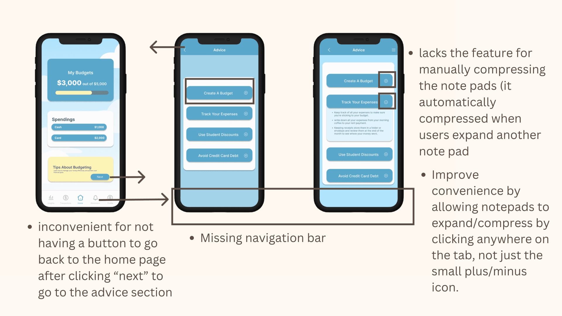
This was a critical turning point. Based on this feedback, we made two key changes:
We overhauled the navigation, adding a global navigation bar and clear "go back" buttons to give users a sense of control.
We cut our planned "notifications" feature. We realized it added unnecessary complexity, going against our core goal of simplicity.
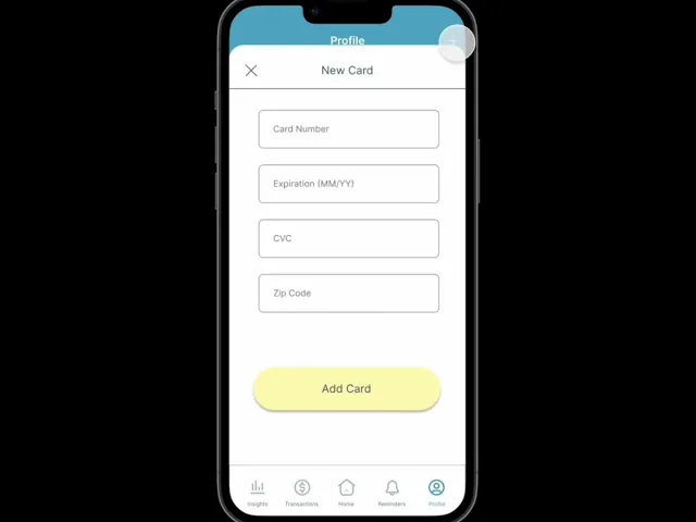
High Fidelity: Bringing Spending Buddy to Life
With insights from testing, we crafted our high-fidelity mockups. We focused on a clean, encouraging visual design that made finance feel less intimidating.
Impact & Reflection
Measurable Outcomes
While this was a conceptual project, our iterative process produced clear results.
60% Estimated Reduction in Usability Issues: By testing and refining our designs based on direct user feedback, we created a high-fidelity prototype that users could navigate with significantly more ease and confidence. We successfully proved it was possible to create a financial tool that empowers, rather than overwhelms, students.
Personal Reflection
This project highlighted the immense value of user testing, even on a tight academic timeline. The humbling feedback we received was the most important data we collected, allowing us to pivot from a "hot mess" to a clear, user-friendly solution. It taught me that being willing to cut features and simplify is just as important as building new ones.
Future Considerations:
Automating the inputs: Right now, users have to manually enter every transaction, which is a major friction point that leads to drop-off. I plan to integrate an API like Plaid to automatically sync bank transactions, making the app much more "set it and forget it."
Moving from tracking to advising: The current charts tell users what they spent, but not how to save. I’d love to implement simple predictive algorithms that alert users when they are trending to overspend before it happens, rather than just reporting it afterwards.
